Fashion Pub “How We Built a Luxury Resale Marketplace That Makes Second-Hand Feel Safe to Buy”

People love luxury fashion. But buying it second-hand online is an act of trust most platforms haven’t earned yet. Fashion Pub set out to change that, and my job was to design the experience that made that trust visible, at every step, before the user ever had to go looking for it.

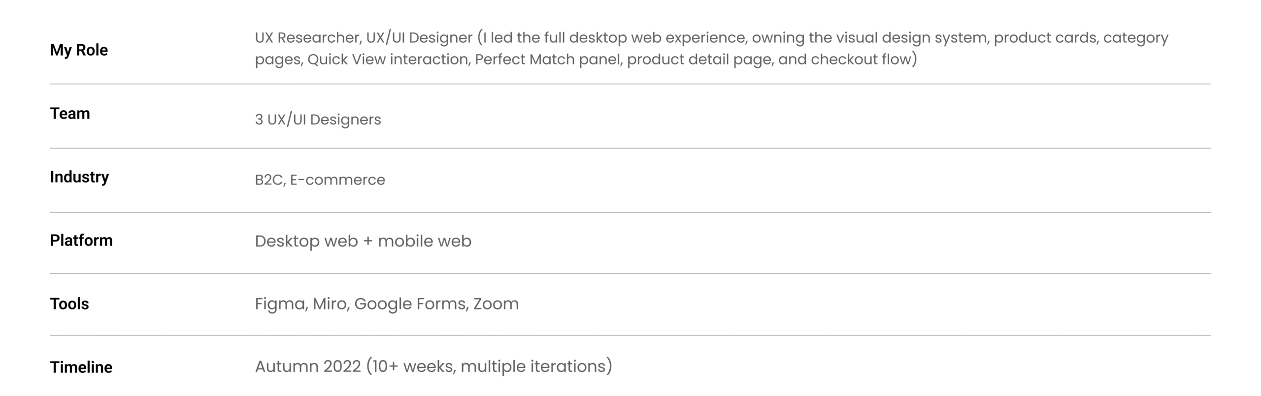
Project Details

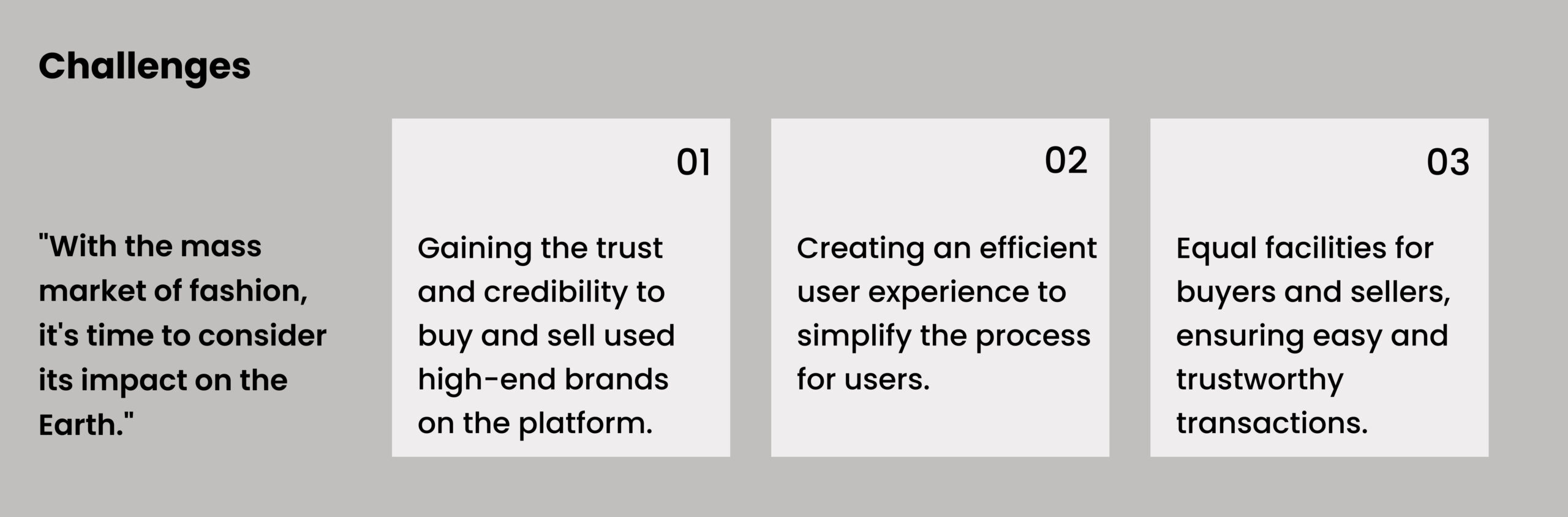
Buying preloved luxury online is an act of trust. Most platforms ask for it without earning it.

The market for second-hand luxury is enormous and growing. People know preloved fashion exists. They know it’s more sustainable, more affordable. Many actively want the better option. But the moment they’re standing in front of an $800 Saint Laurent bag on a screen, something stops them.

Is it real? Is “Great Condition” actually great? What if it’s not what I expected?

Most platforms bury their trust signals. Authentication lives in the FAQ. Condition descriptions are written by sellers with no standardization. The checkout process asks you to confirm payment before your last doubt has been resolved.

Our question from day one: what if trust wasn’t something users had to go looking for, but something they felt before they even clicked?

Research

We talked to 50 people before we opened Figma.

Price wasn’t the problem.

We ran a survey with 50 participants and followed up with 8 in-depth interviews.

I went in expecting price sensitivity to be the dominant barrier. It wasn’t.
71% of survey respondents said their primary concern was authenticity anxiety and inaccurate condition reporting not cost. The interviews gave those numbers a human texture the survey couldn’t capture alone.

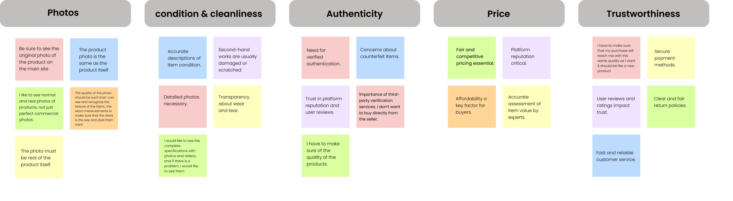
Three things came out of every single conversation:

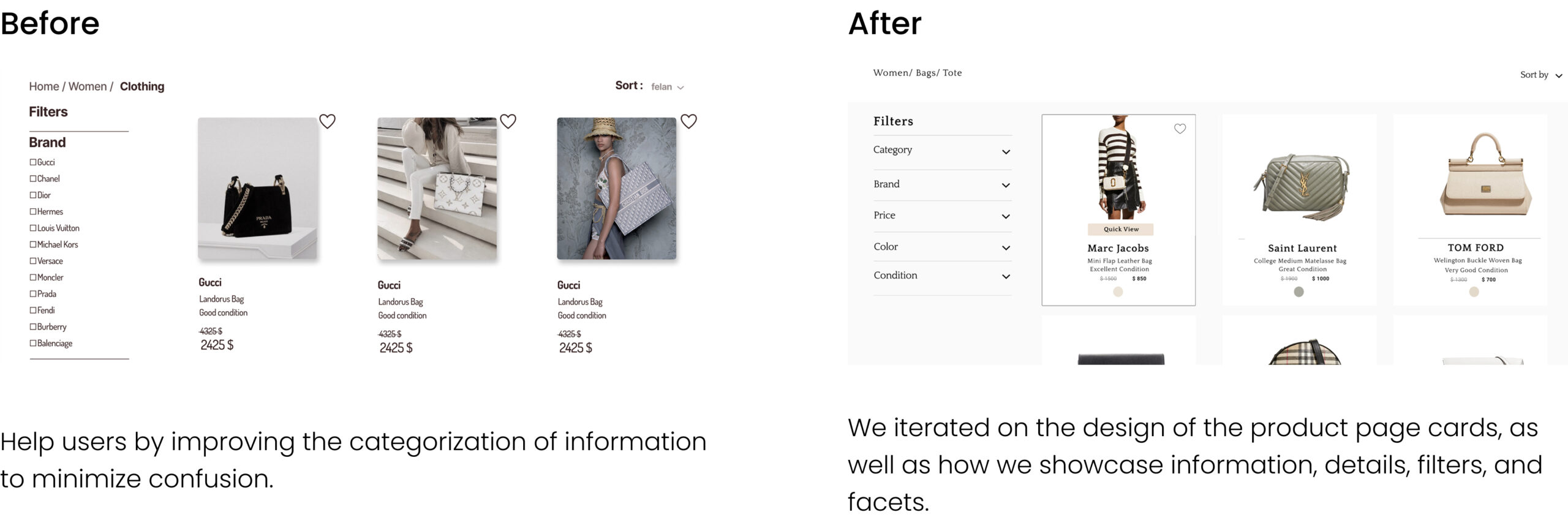
Trust signals are invisible at the wrong moment. Users weren’t waiting until the product detail page to form doubts. The anxiety started at the card. If a card didn’t immediately signal credibility, they scrolled past before ever reaching our authentication work.
“I’ve trained myself to keep scrolling unless something immediately feels legit.”

Condition language written by sellers means nothing. Words like “lightly used” had been burned into users’ skepticism by previous bad experiences. Every participant wanted standardized, platform-controlled ratings backed by real photographs not seller copy.
“‘Excellent condition’ on one site means scratches everywhere on another. I don’t trust any of it.”

The shopping experience itself was creating hidden fatigue. This one only surfaced in usability testing not in the interviews. It became the most important finding of the entire project.

The reframe: We stopped thinking about building a marketplace. We started designing a trust journey mapping every screen to one question: what doubt exists at this moment, and how does the design resolve it before the user moves on?

Interview & Afinity Diagram

Key Research Takeaways

  • Users need platform-verified condition ratings not descriptions written by sellers they have no reason to trust.
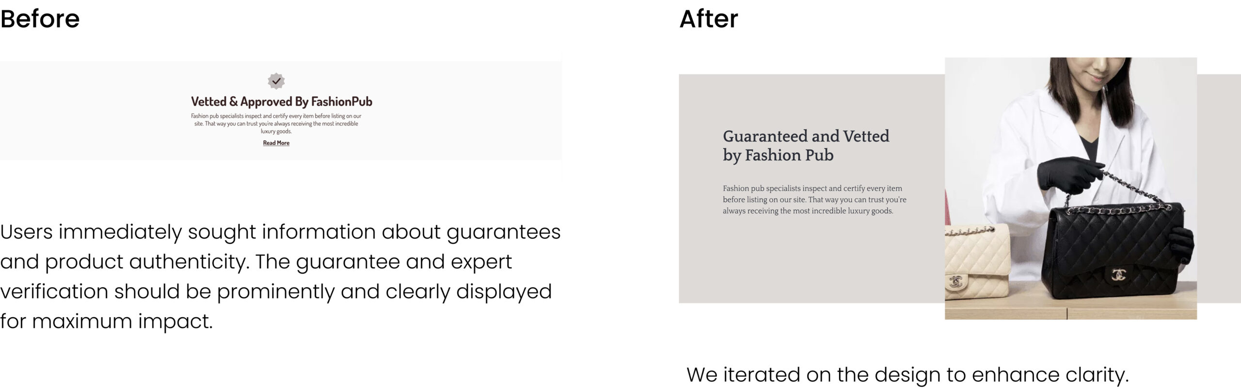
  • Authentication must be visible immediately at browse level if users have to search for it, trust is already damaged
  • Third-party expert verification is the single most reassuring signal a platform can offer.
  • Clear return policies are an expected minimum their absence destroys trust, their presence alone doesn’t build it.

Competitive Analysis

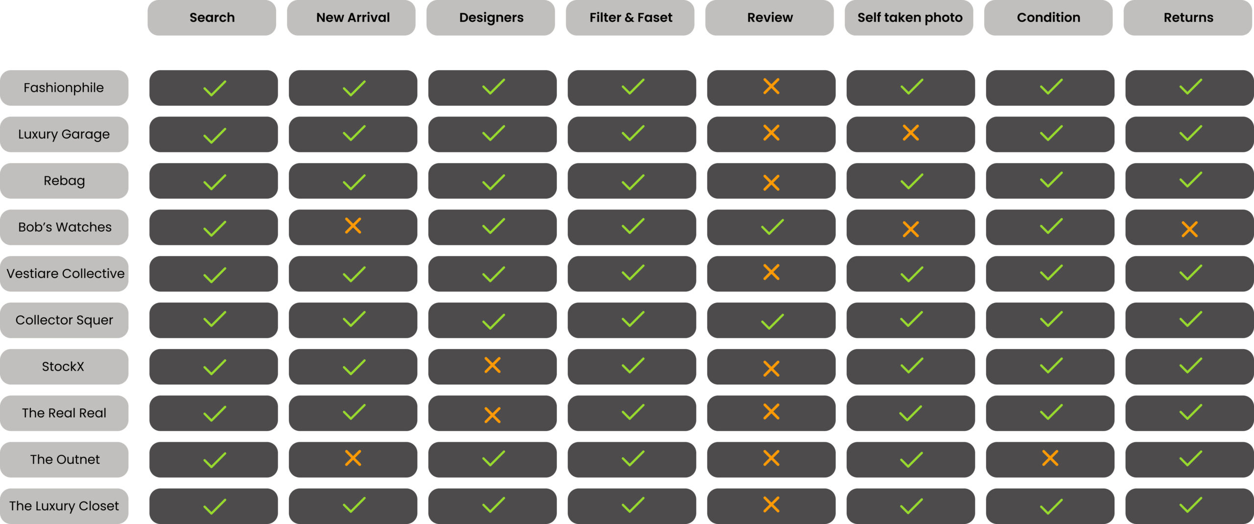
We audited 10 platforms; Vestiaire Collective, Sellpy, Tradera, The RealReal, Vinted, and five others, mapping each against the trust signals our users said they needed most.

The honest finding: most platforms had done the functional work well. Search was solid. Categories were logical. Return policies existed.

What almost none of them had done was make trust visible. Authentication was buried in FAQs or deep inside product listings. Condition ratings were inconsistent or seller-written. The checkout asked users to pay before resolving their final doubt.

The gap we identified: Be the only platform where trust is present throughout the entire experience not something a motivated user can find if they go looking.

The pattern was consistent across all 10 platforms: trust signals existed but were invisible at the exact moments users needed them most.

Persona

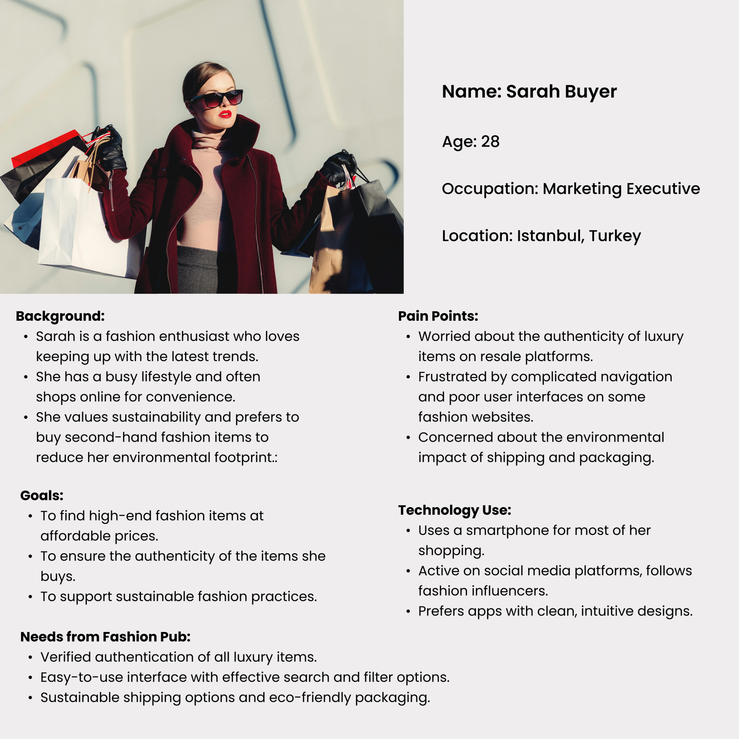
Every decision we made was filtered through one person: Sara.


Sara is 31, based in a major city, works in marketing. She loves fashion and cares about sustainability, but she buys second-hand only in person, at curated vintage shops where she can touch and inspect items herself. Online luxury resale makes her nervous. She was once sold something described as “very good condition” that arrived damaged. She hasn’t bought online since.
She’s not price-sensitive. She’s burned-once cautious.
What Sara needs: To feel the platform has already done the verification work for her before she has to ask.
What this means for design: Every trust signal needs to reach Sara before she has to seek it out. If she’s searching for proof of quality, we’ve already lost her.

Sara shaped every prioritisation decision that followed. If a feature didn’t directly reduce her doubt at a specific moment in the journey, it moved down the list.

Prioritisation- Impact vs Effort

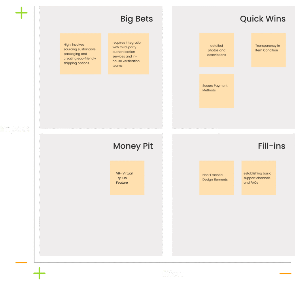
Before moving into design, we mapped every potential feature against two axes: how much impact it would have on user trust, and how much effort it would take to implement.

The clearest Quick Wins were all trust-related and they directly shaped what we designed first:

  • Surfacing the authentication badge at browse level, not just the product page
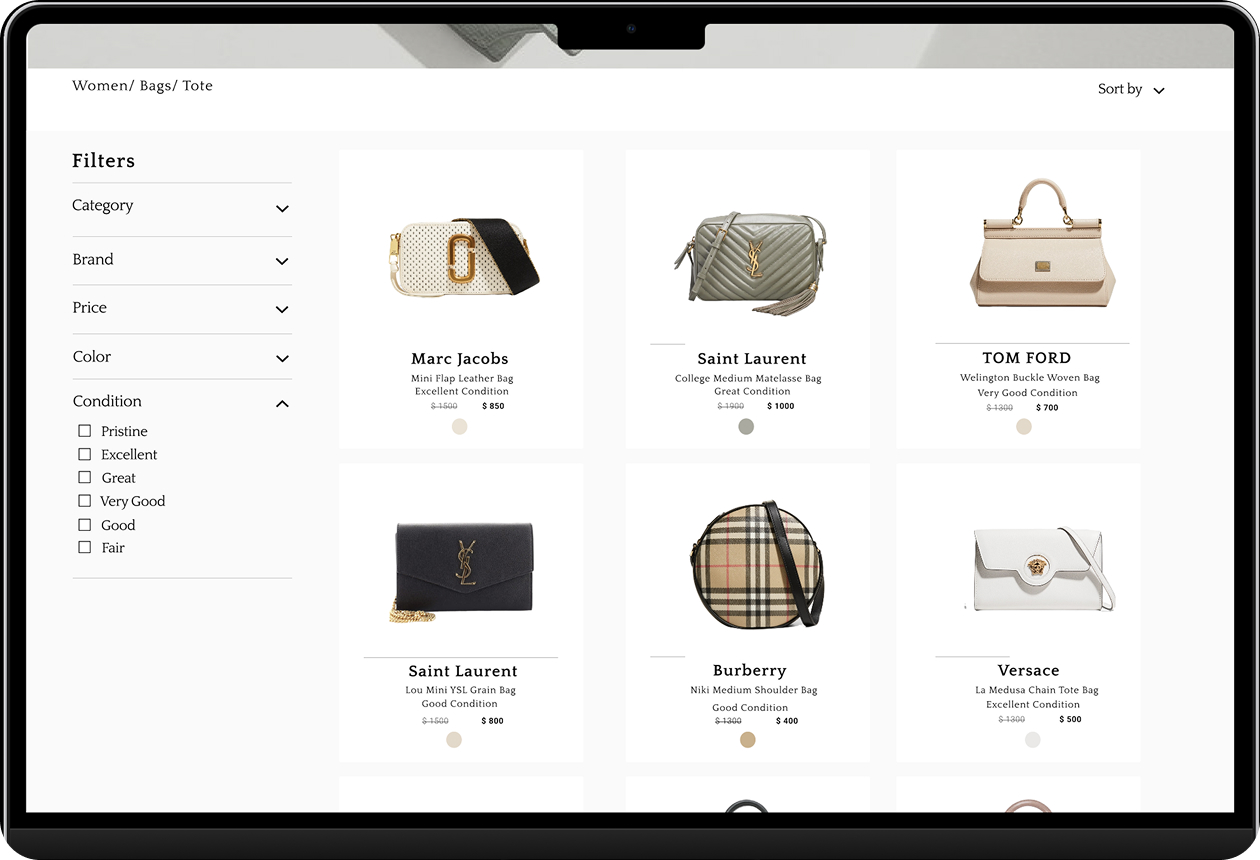
  • Replacing seller-written condition descriptions with a platform-controlled visual scale
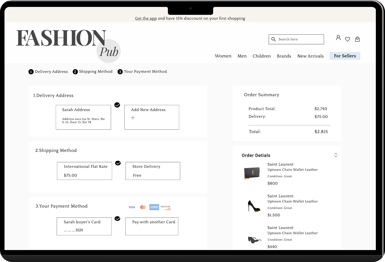
  • Adding a trust summary to the checkout flow before payment confirmation

These three decisions required focused design effort but no additional technical complexity. They addressed the primary anxieties our research had surfaced and they became the backbone of the final product.

Features like Live Chat and VR try-on were identified as high-effort investments valuable for a future phase, but not the right focus for a first version trying to establish trust as its foundation.

Customer Journey Map

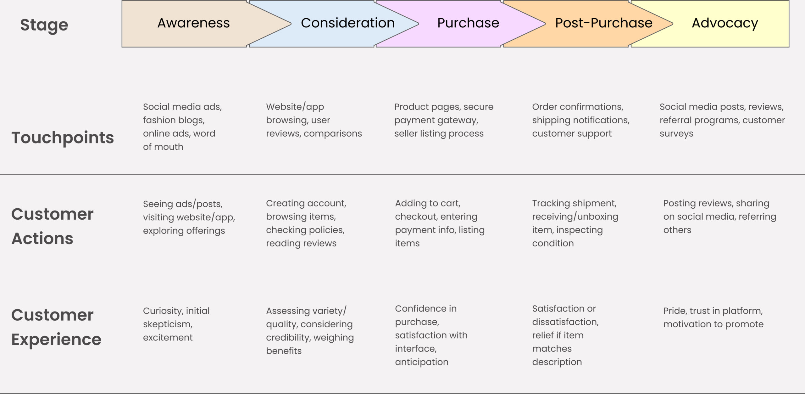
The journey map made one thing undeniable: doubt doesn’t appear at one moment it accumulates. A user who feels slightly uncertain at the product card, slightly more uncertain after reading a condition description, and still uncertain at checkout is a user who abandons.

Trust has to be managed at every stage, not resolved at the end. This insight turned the journey map from a process deliverable into a genuine design tool showing us exactly where our authentication work needed to appear, and in what form, at each step.

The Moment That Changed Everything

One of my clearest memories from this project is our card sorting sessions, the three of us debating information architecture in detail, which categories should be visible upfront, how product types should be grouped. It felt almost excessive at the time. Looking back, that obsessive attention to organization is exactly what led us to fix the biggest usability problem in the product.

In our first round of testing, something happened that genuinely surprised me.

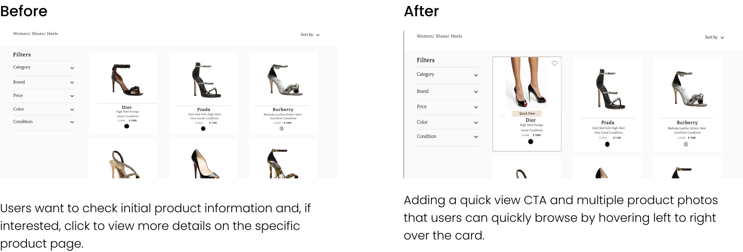
Users were getting frustrated visibly not by bad design, but by the act of opening individual product pages. They’d spot something interesting, click through, decide it wasn’t right in three seconds, go back, click something else, go back again. After a few minutes, one participant said:

“I just want to see what it looks like without going through all of this.”

We’d built a beautiful product page. We were proud of it. But the repeated navigation was exhausting users before they reached anything they actually wanted.

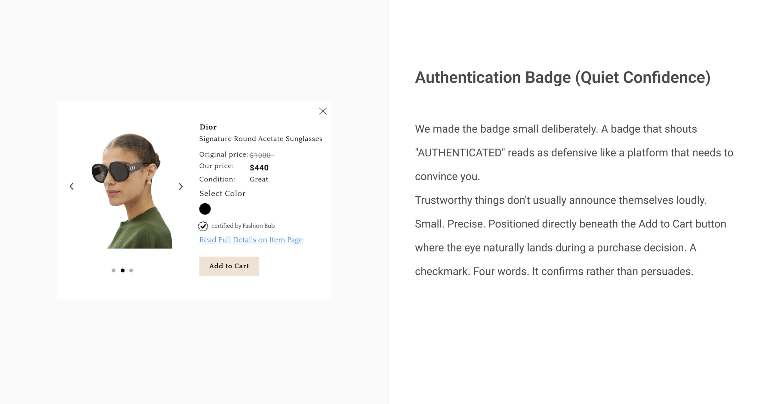
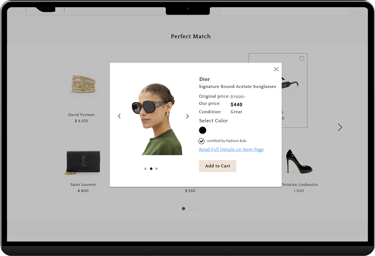
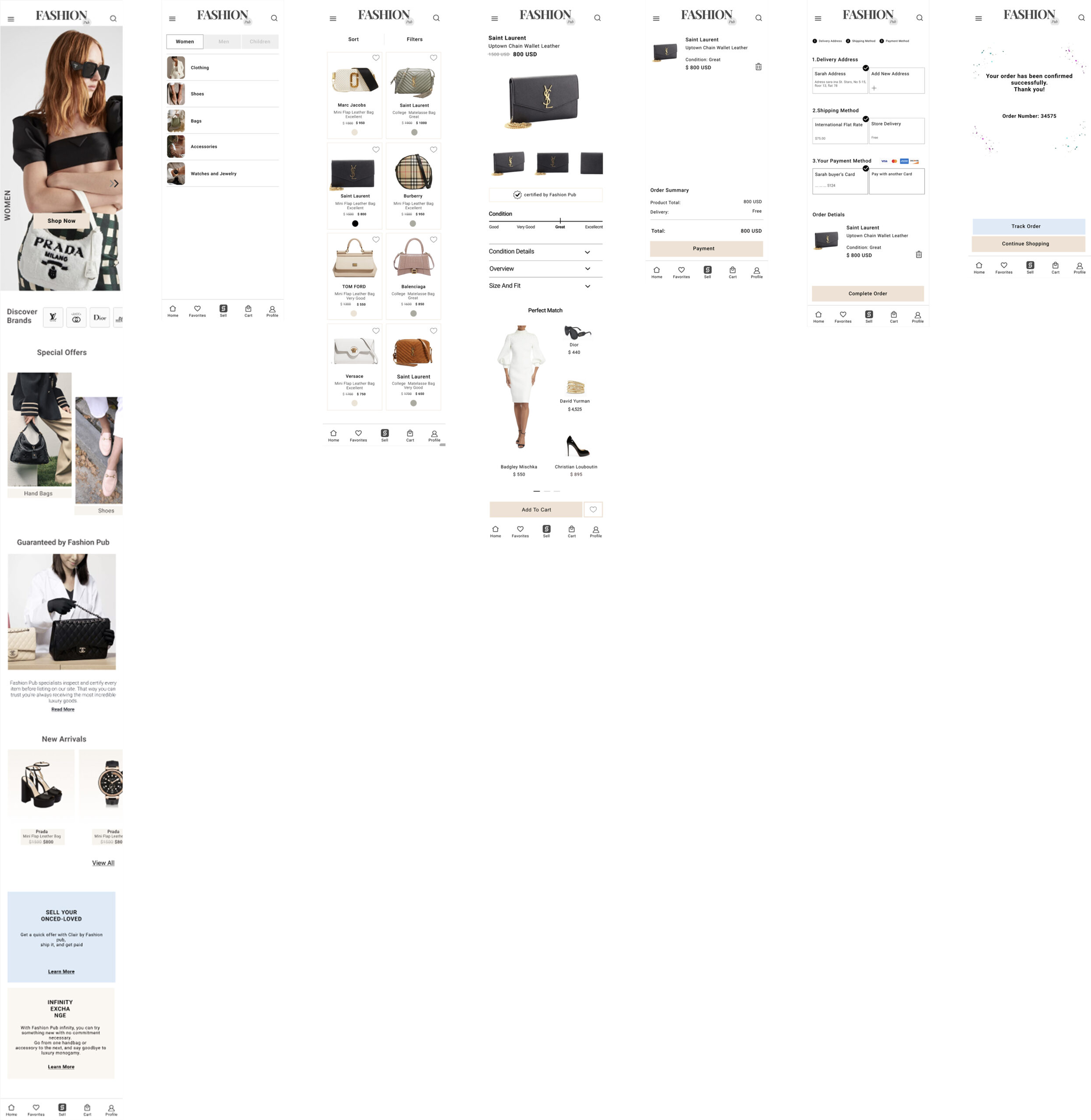
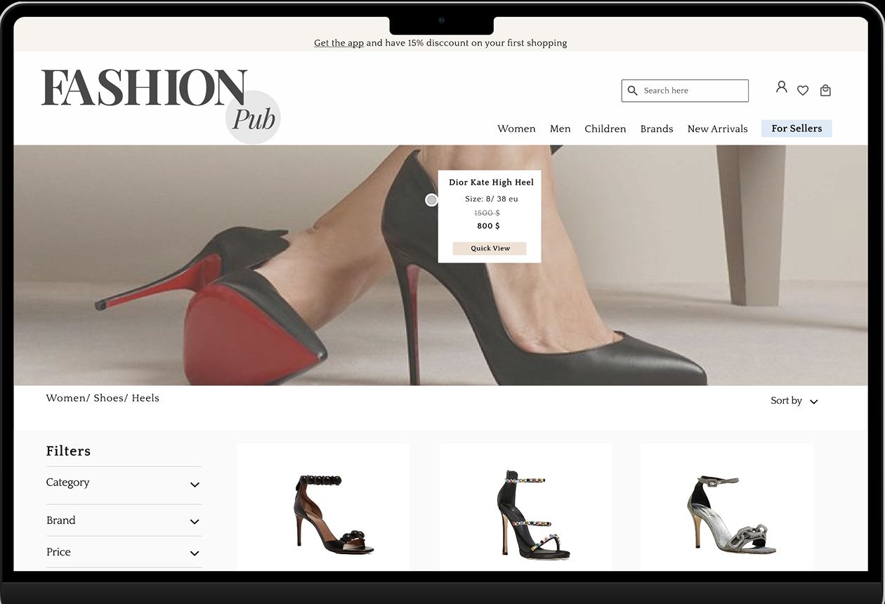
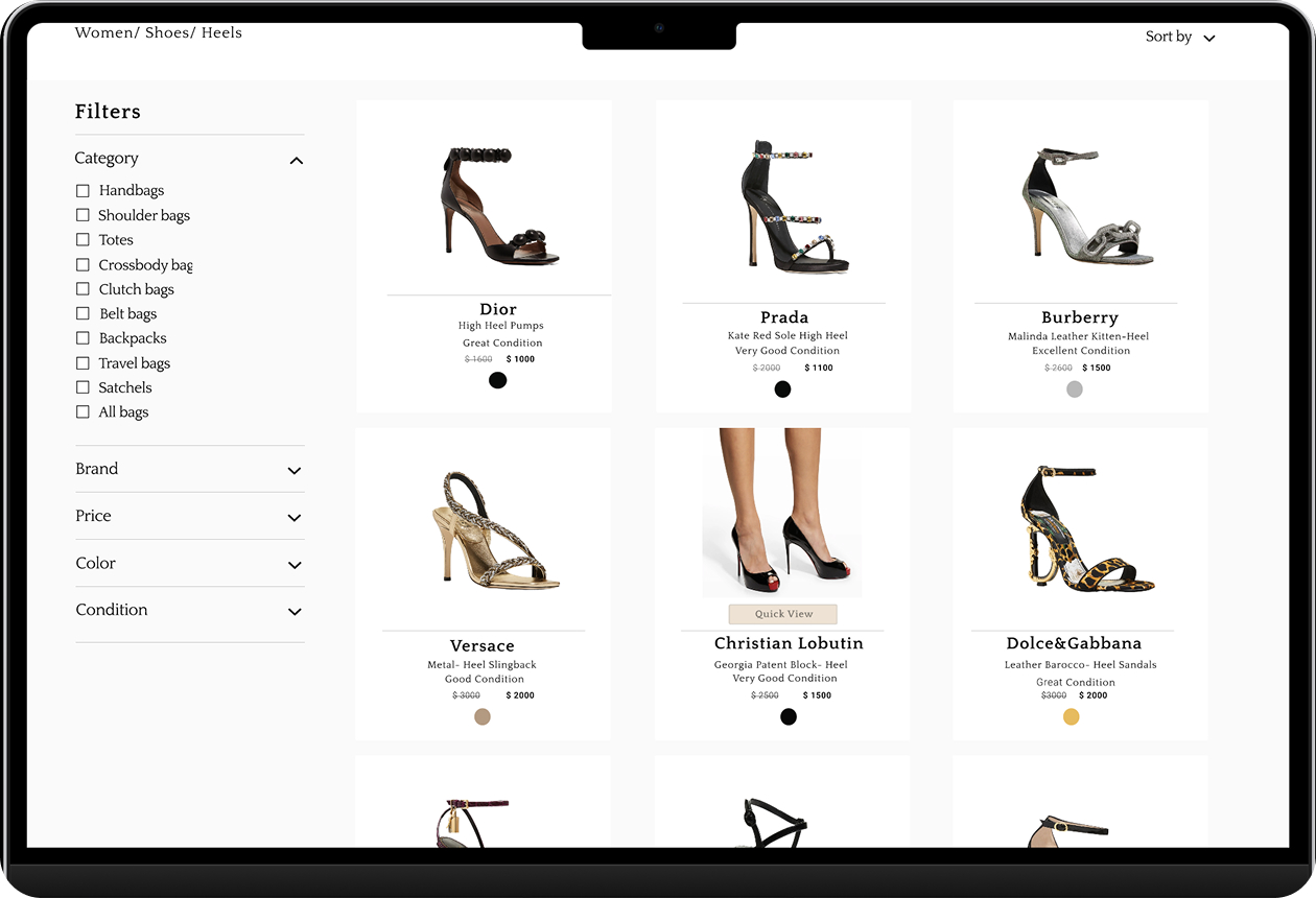
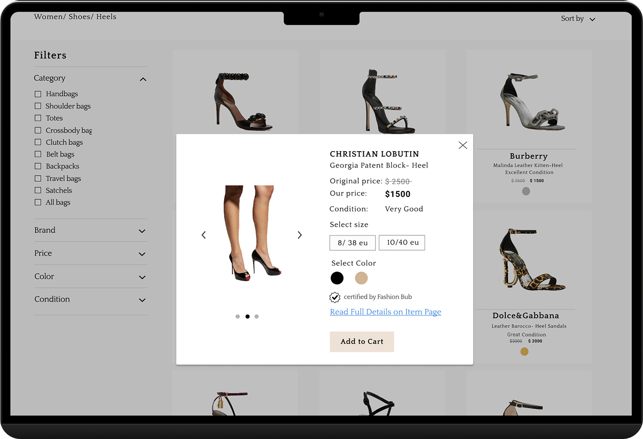
After a long brainstorming session we designed a Quick View feature, a hover overlay showing the product image, condition rating, price, color options, the certification badge, and a direct Add to Cart option. If you want more detail, one link takes you to the full product page. If not, close it and keep scrolling.

When we tested it in round two, the change was immediate. Navigation fatigue disappeared.

That feature born entirely from watching a real person use the product and listening to their frustration is what I’m most proud of in this project.

Key Design Decisions

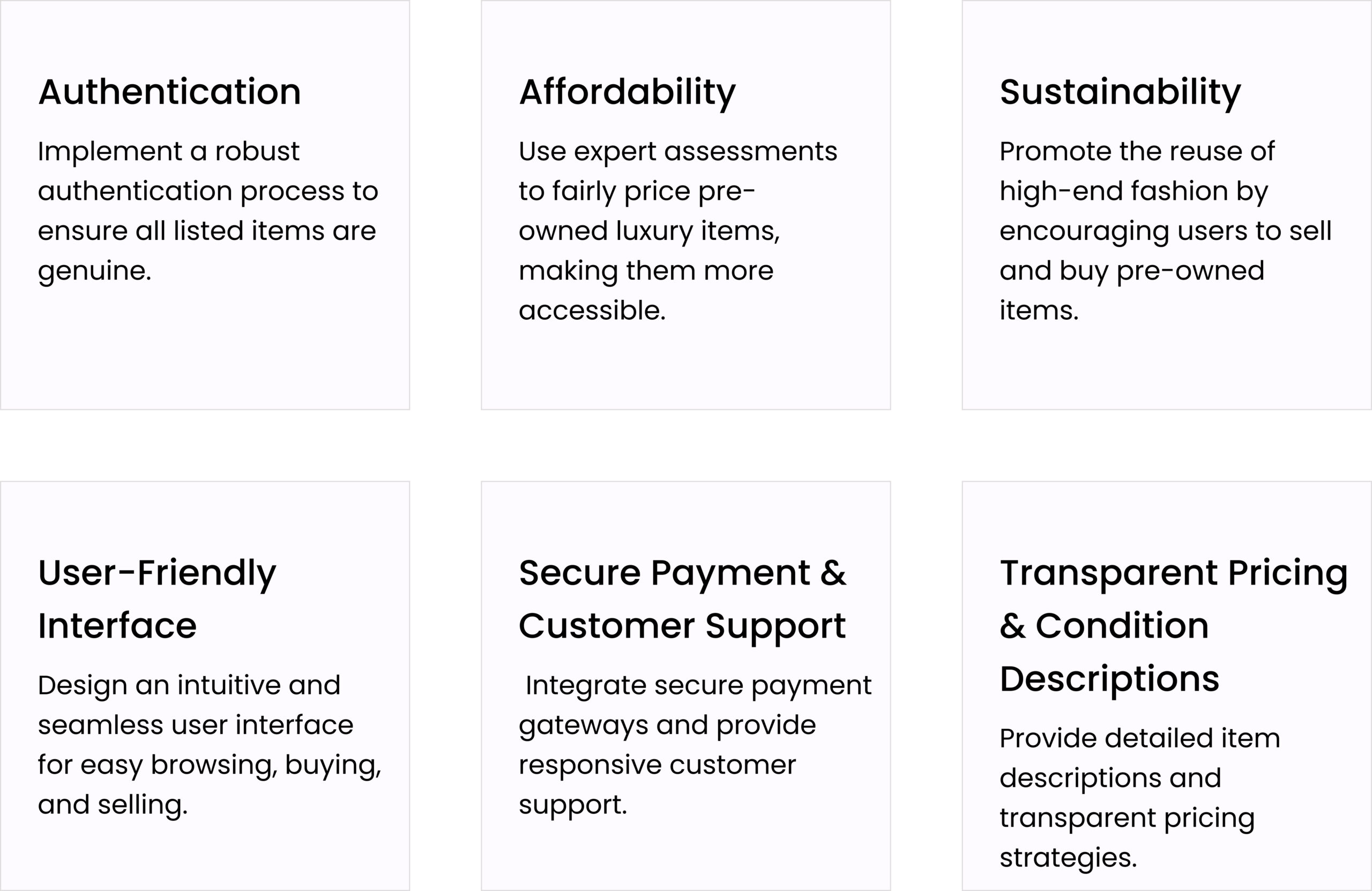
Every decision passed through one filter: does this reduce doubt at this specific moment?

🛡️ Authentication badge, Quick View and product page

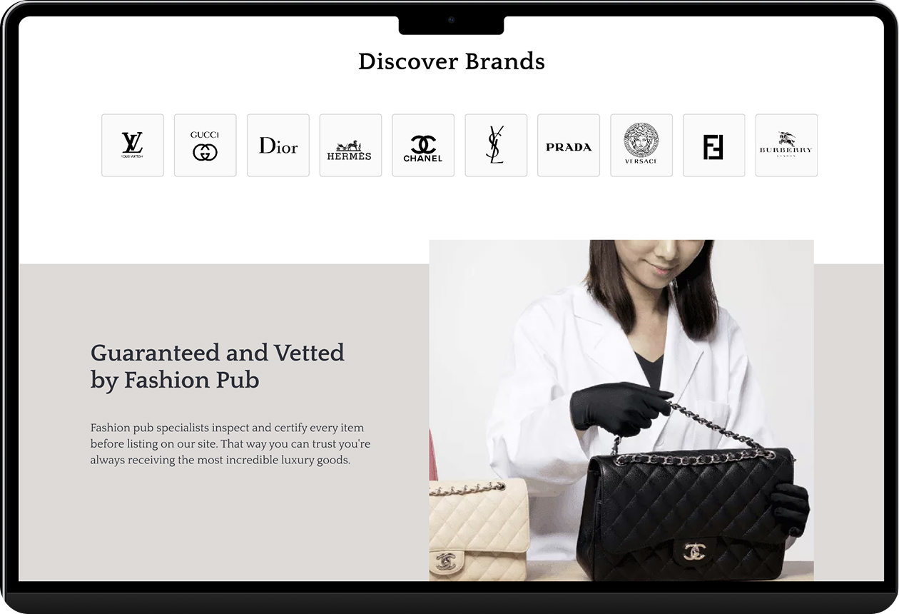
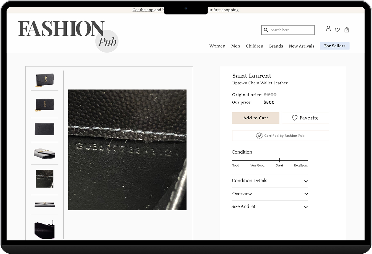
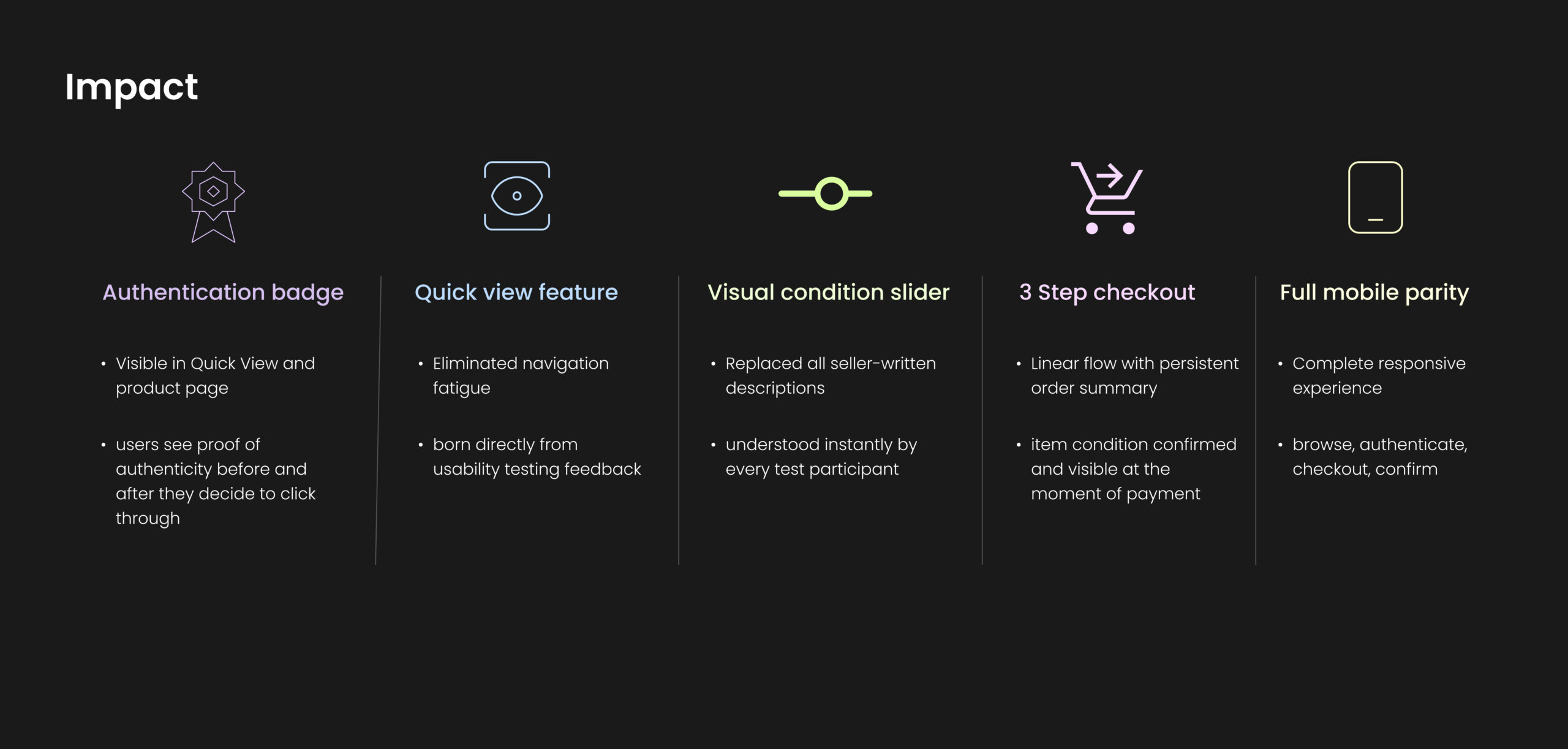
Designed to appear in the Quick View modal and on the product detail page, so trust is present wherever the purchase consideration happens, not just at the final step. If a user is considering a product, the platform’s guarantee should be visible to them at that exact moment.

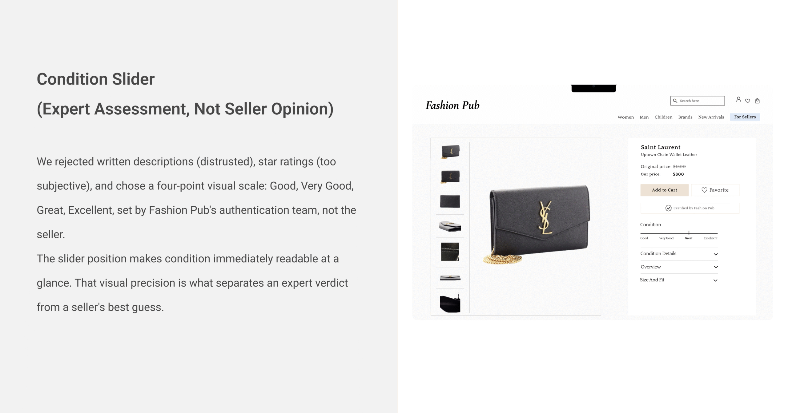
🎚️4 point visual condition slider

Replaced all seller-written descriptions with a platform-enforced scale: Good, Very Good, Great, Excellent, set by Fashion Pub’s authentication team, not the seller. Understood instantly by every test participant, zero explanation needed.

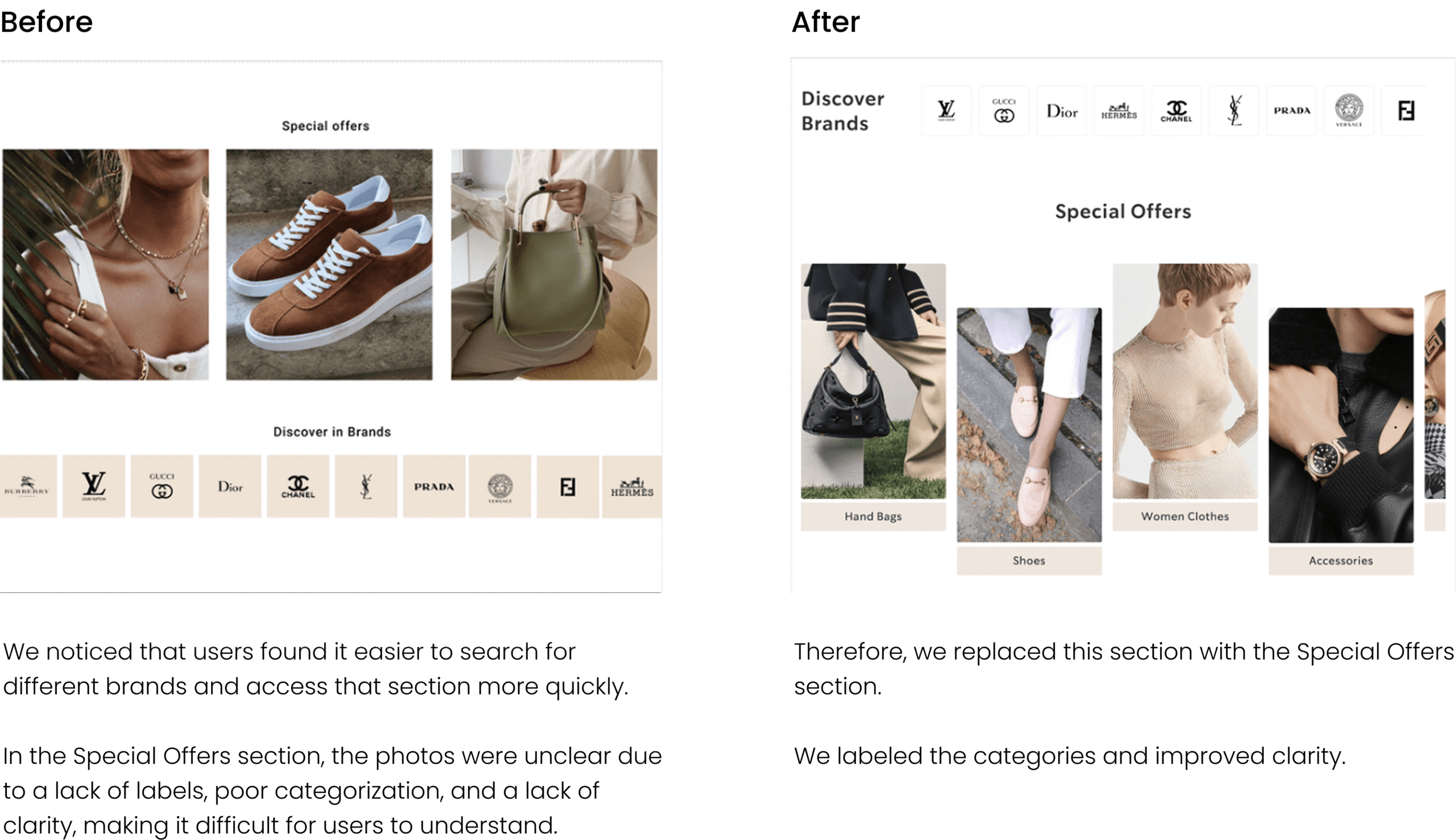
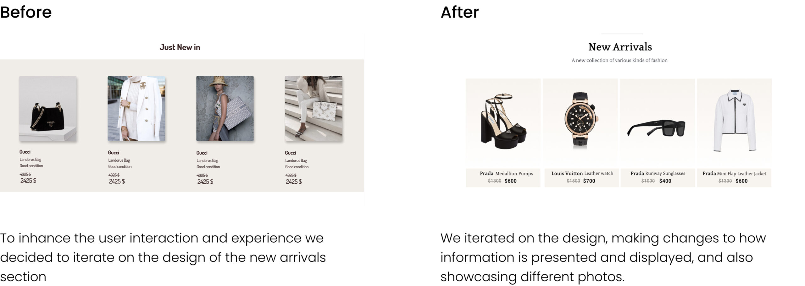
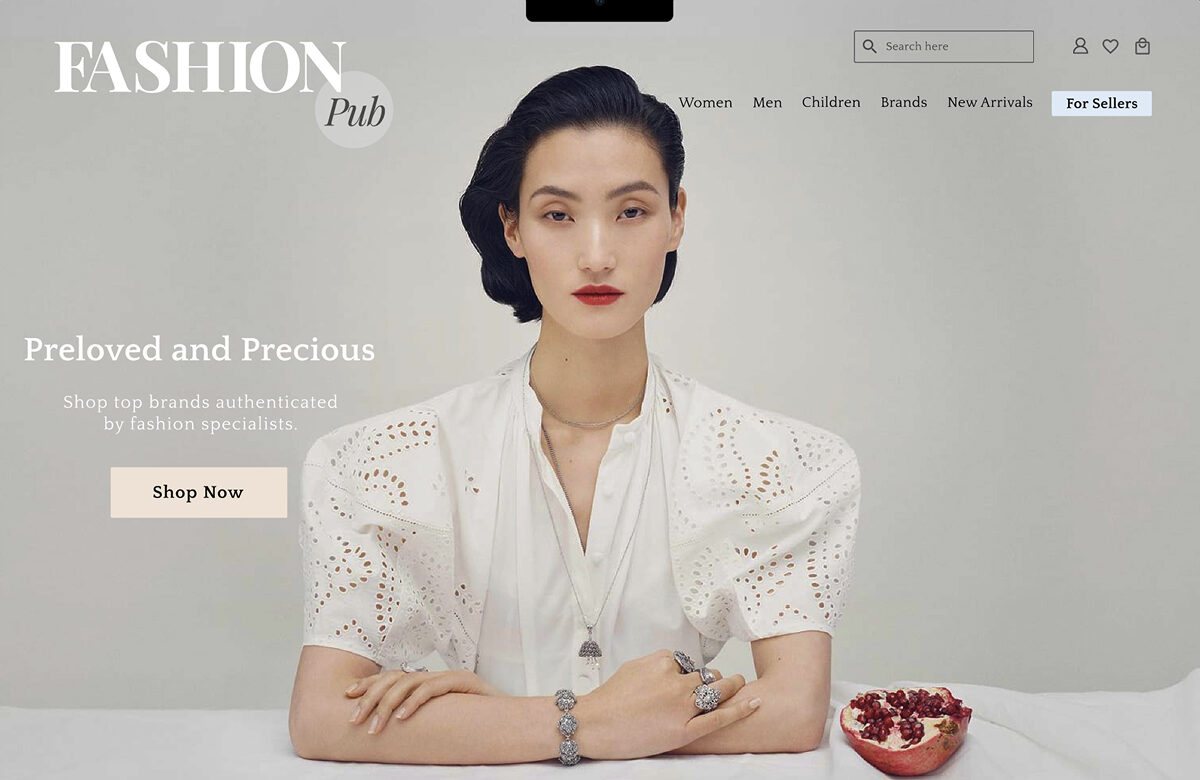
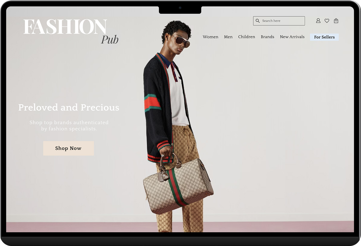
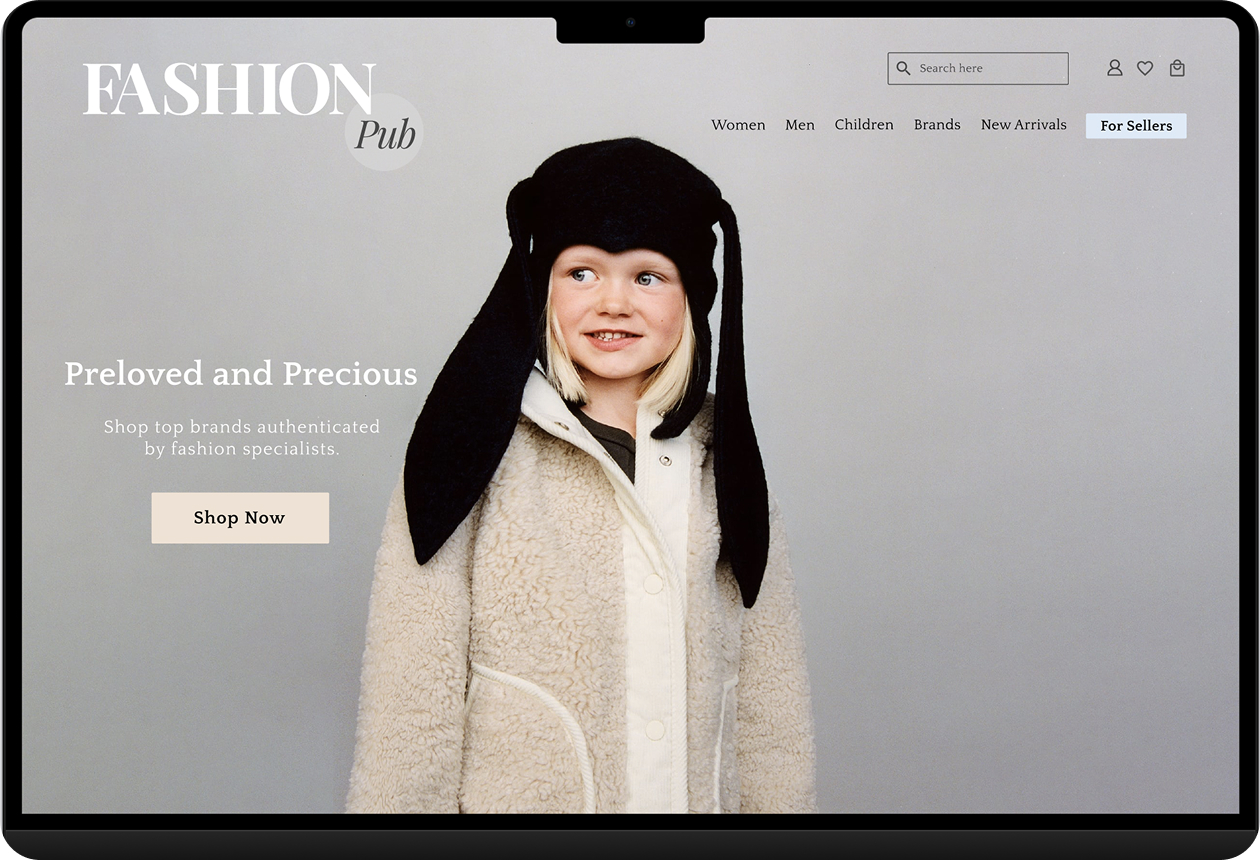
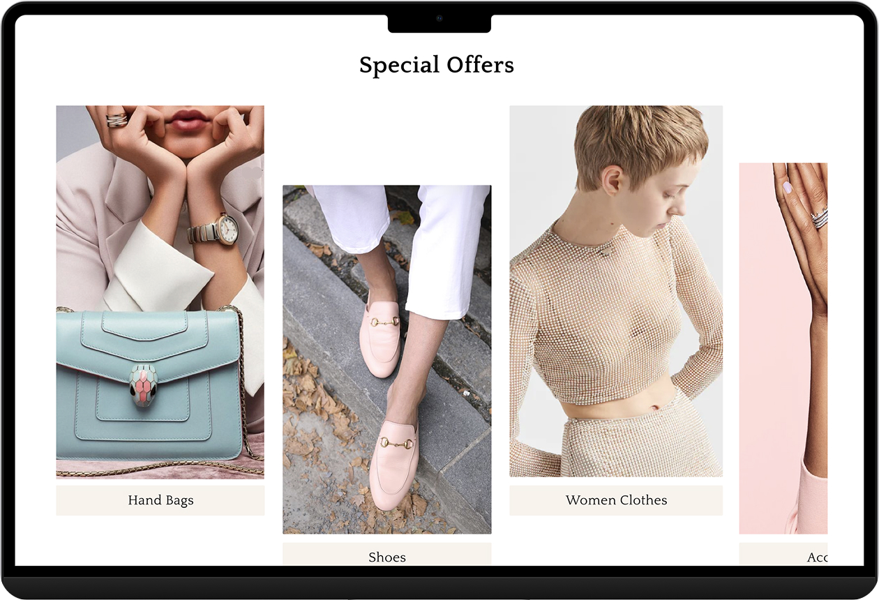
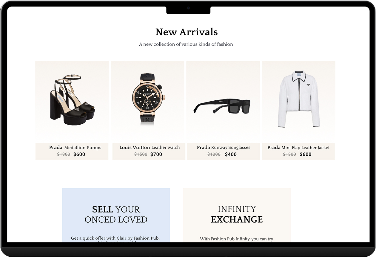
🏠Curated homepage over maximum inventory

Our research, and interview participants who described dense competitor layouts as feeling like a “charity shop”, showed that curation is itself a trust signal. A boutique homepage with full inventory one level deeper. Users in testing called it “more trustworthy than expected” without being prompted.

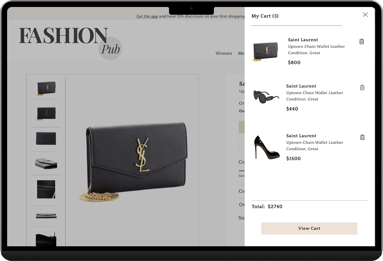
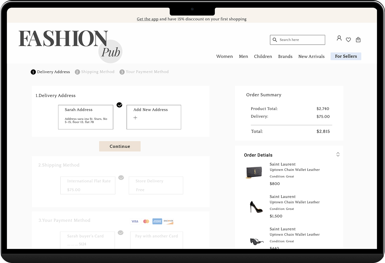
🛒Condition label persistent through checkout

Each item in the order summary shows its condition label alongside the price. At the moment of payment, users don’t have to trust their memory of what they agreed to buy. It’s confirmed right there one final reassurance before they click Complete Order.

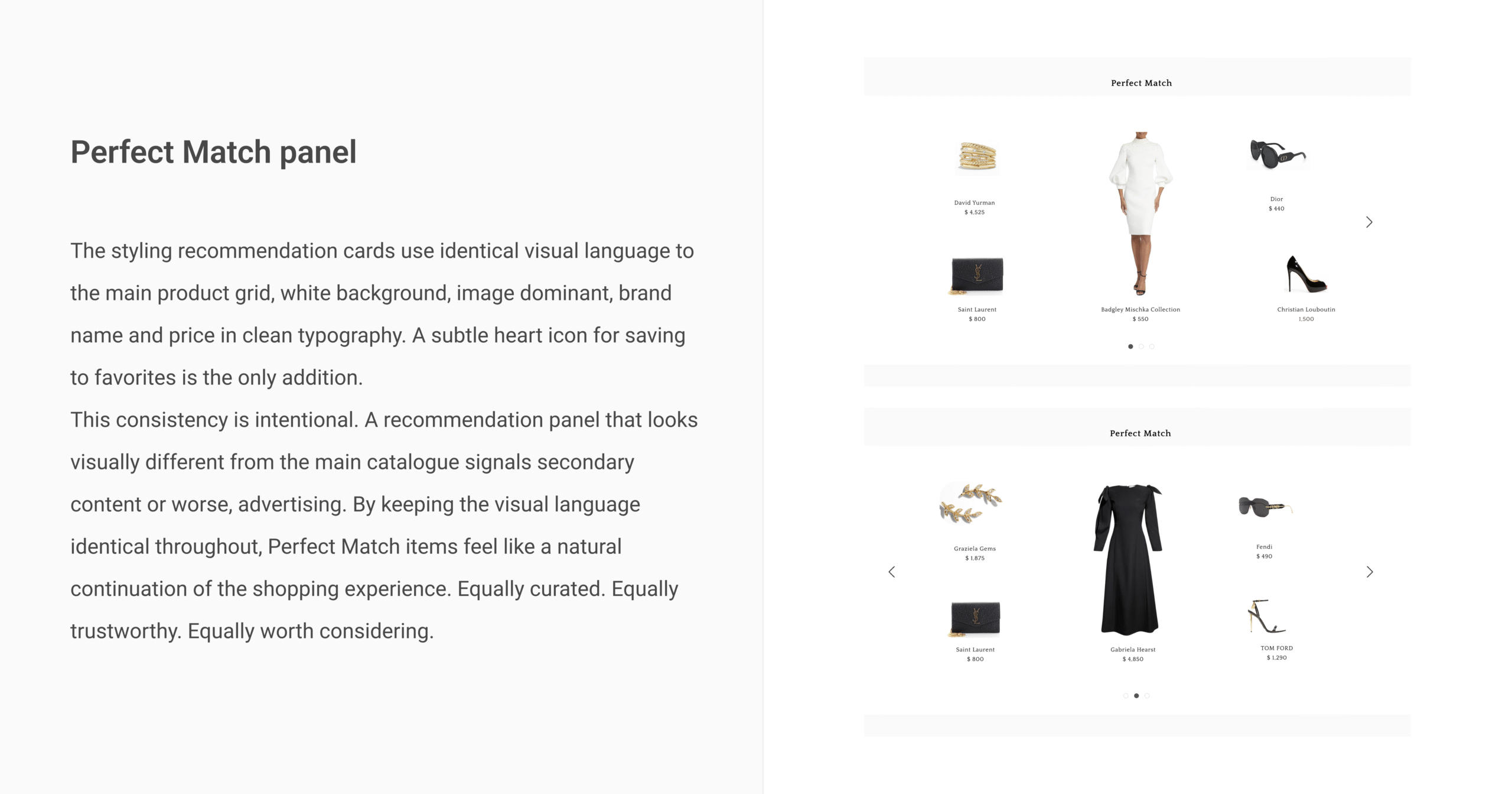
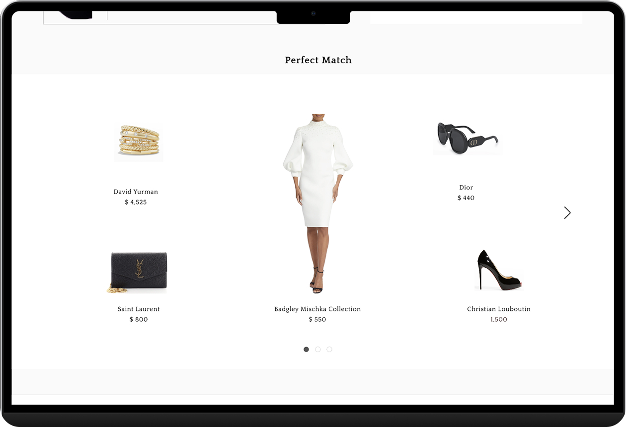
🌟Perfect Match, styling as a competitive differentiator

During our competitive audit, one gap stood out beyond trust: no second-hand luxury platform helped users understand how a product fits into a complete look. Every competitor showed products in isolation. You had to imagine the rest yourself.

We designed the Perfect Match panel to close that gap. On each product detail page, scrolling below the main product surfaces a curated carousel of complementary items, pieces that work together stylistically. A Saint Laurent bag alongside a Badgley Mischka dress, Christian Louboutin heels, Dior sunglasses as a finishing detail.

This does two things simultaneously. For the user, it extends discovery without leaving the product page, reducing friction and keeping engagement within the platform. For the brand, it positions Fashion Pub as a styling authority, not just a listing service. A platform that can dress you completely understands luxury at a level that builds trust beyond any badge.
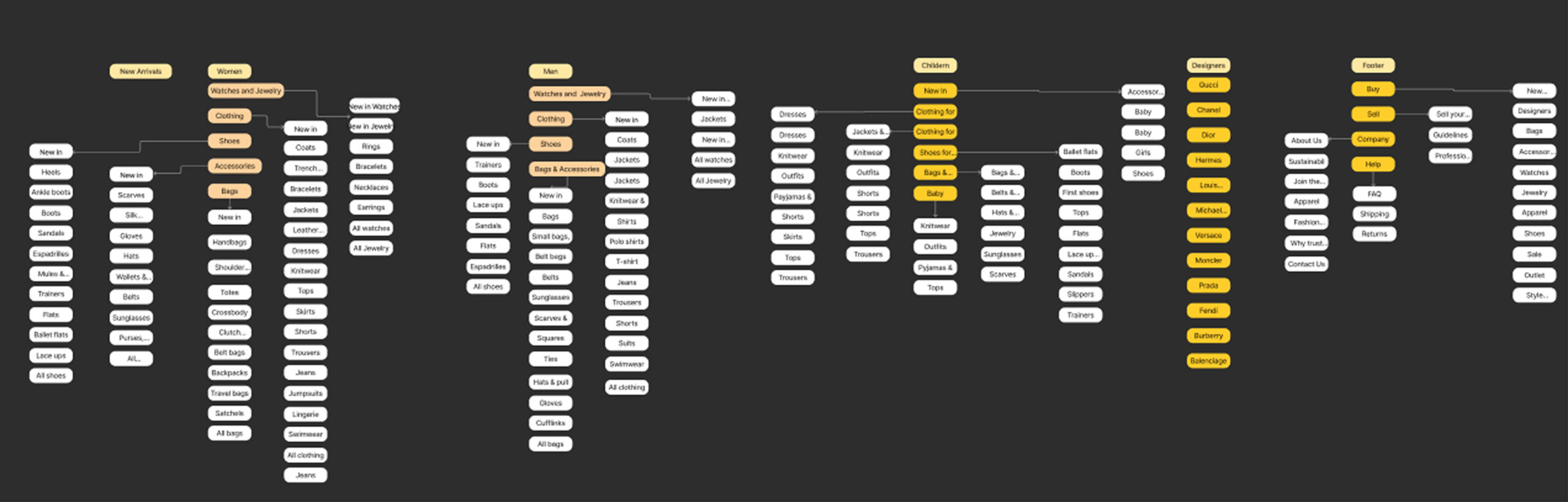
Information Architecture

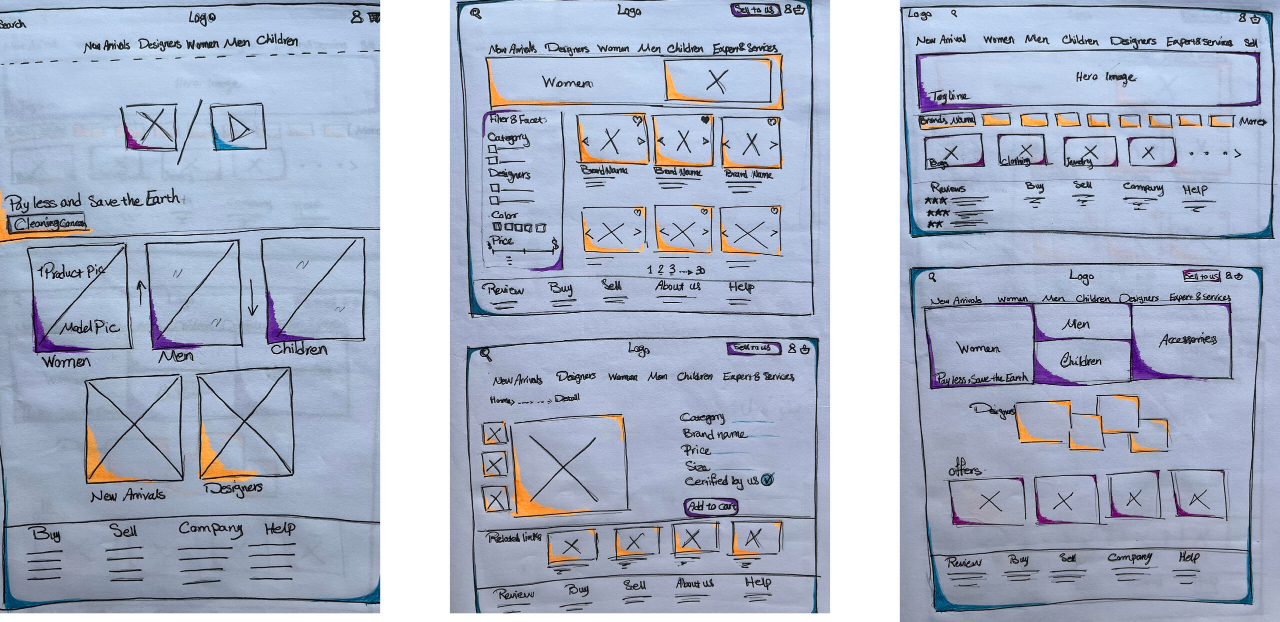
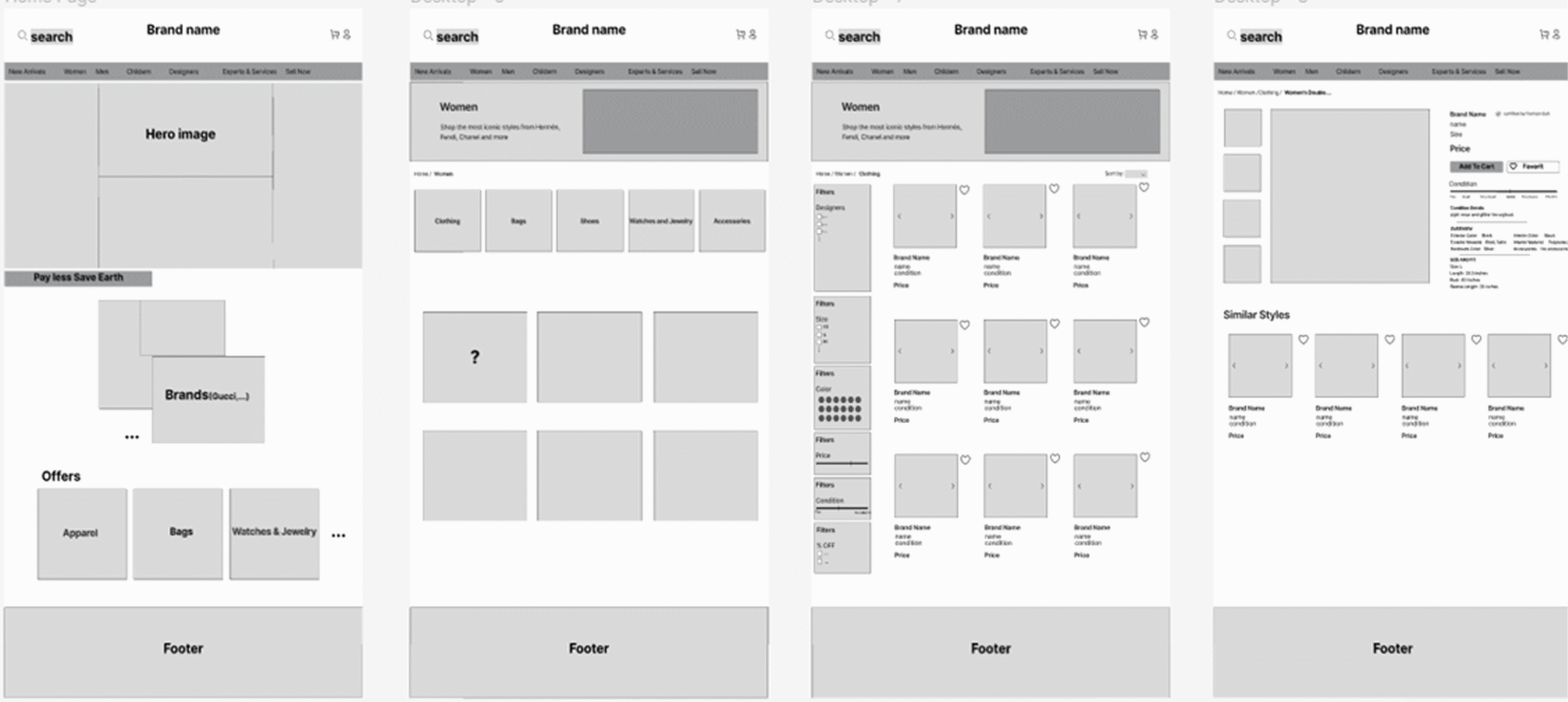
Wireframes

Wireframing was deliberately fast and lo-fi. The goal wasn’t aesthetics, it was mapping where trust signals needed to appear in the flow. Every wireframe was annotated with one question: what does the user doubt here, and how does the design resolve it?

This kept the team focused on function before form and meant that when we moved to high-fidelity, every visual decision already had a reason behind it.

Visual Direction (Every Decision Has a Reason)

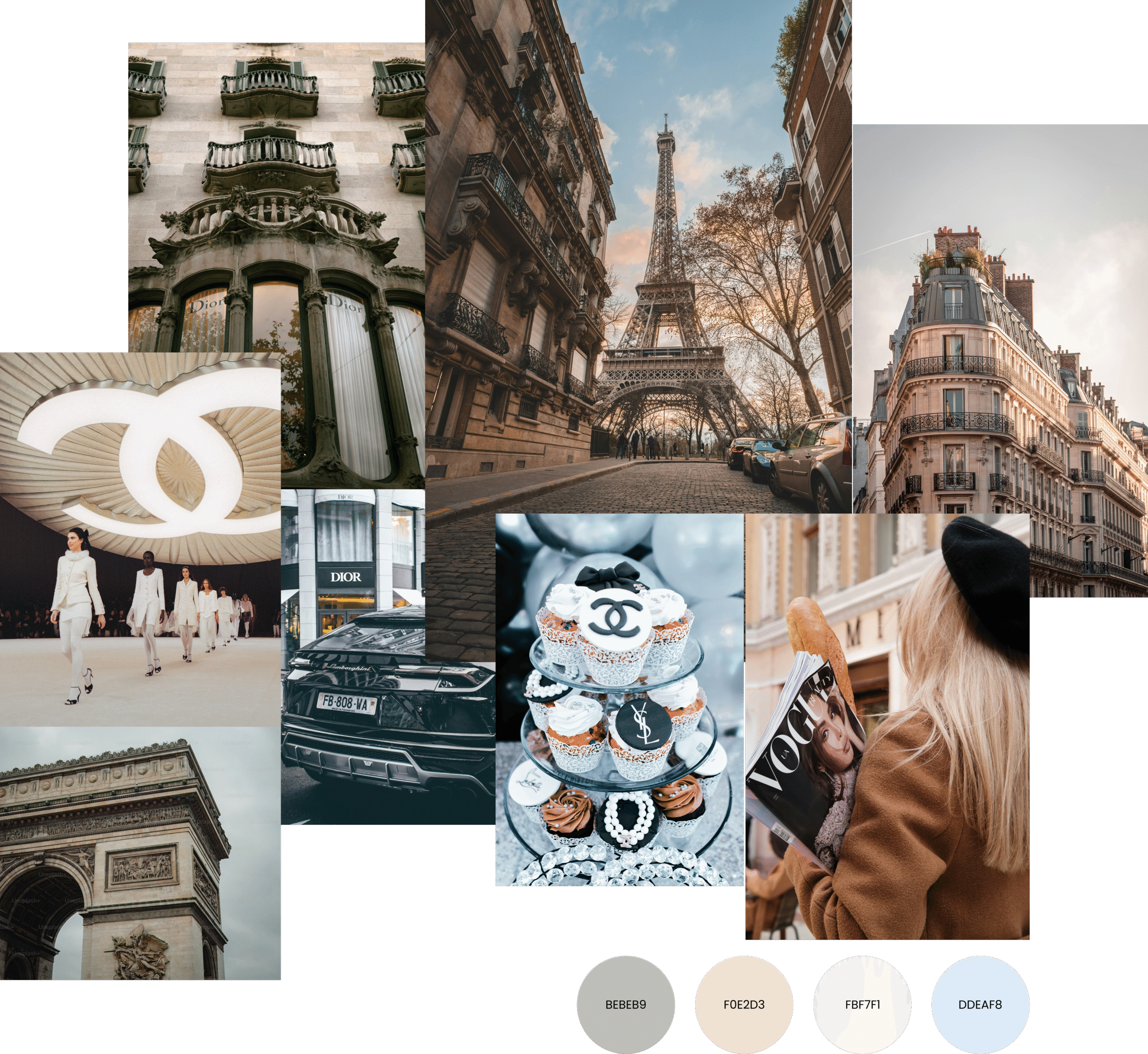
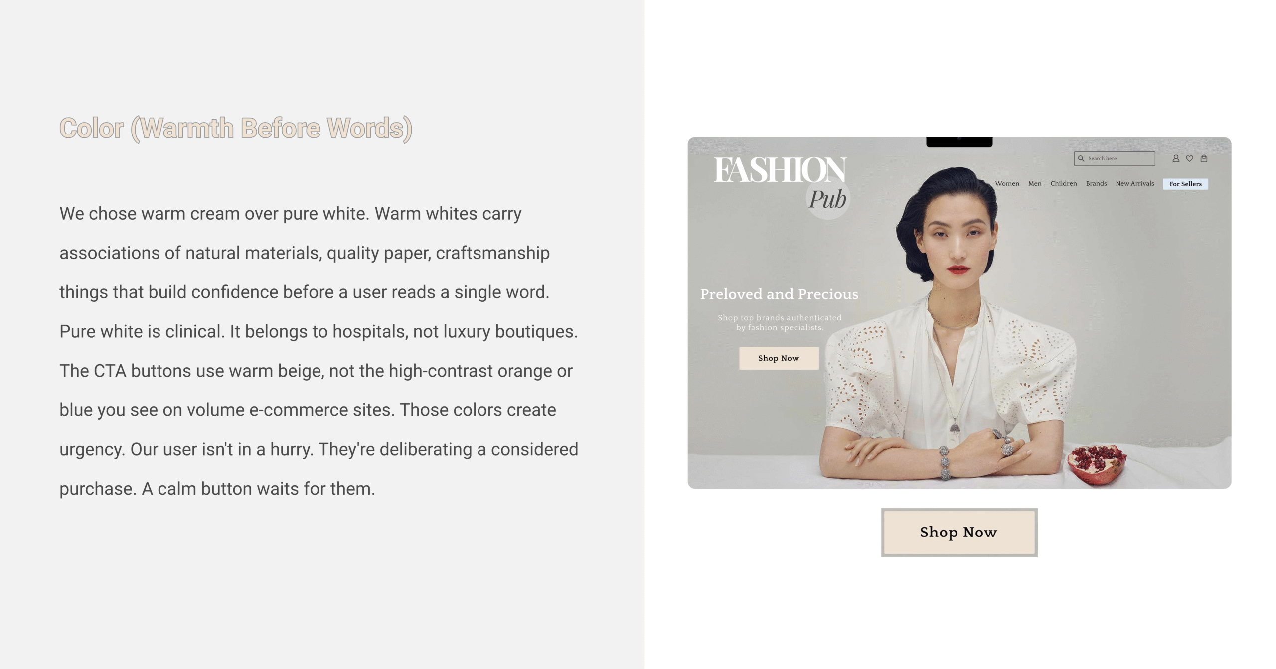
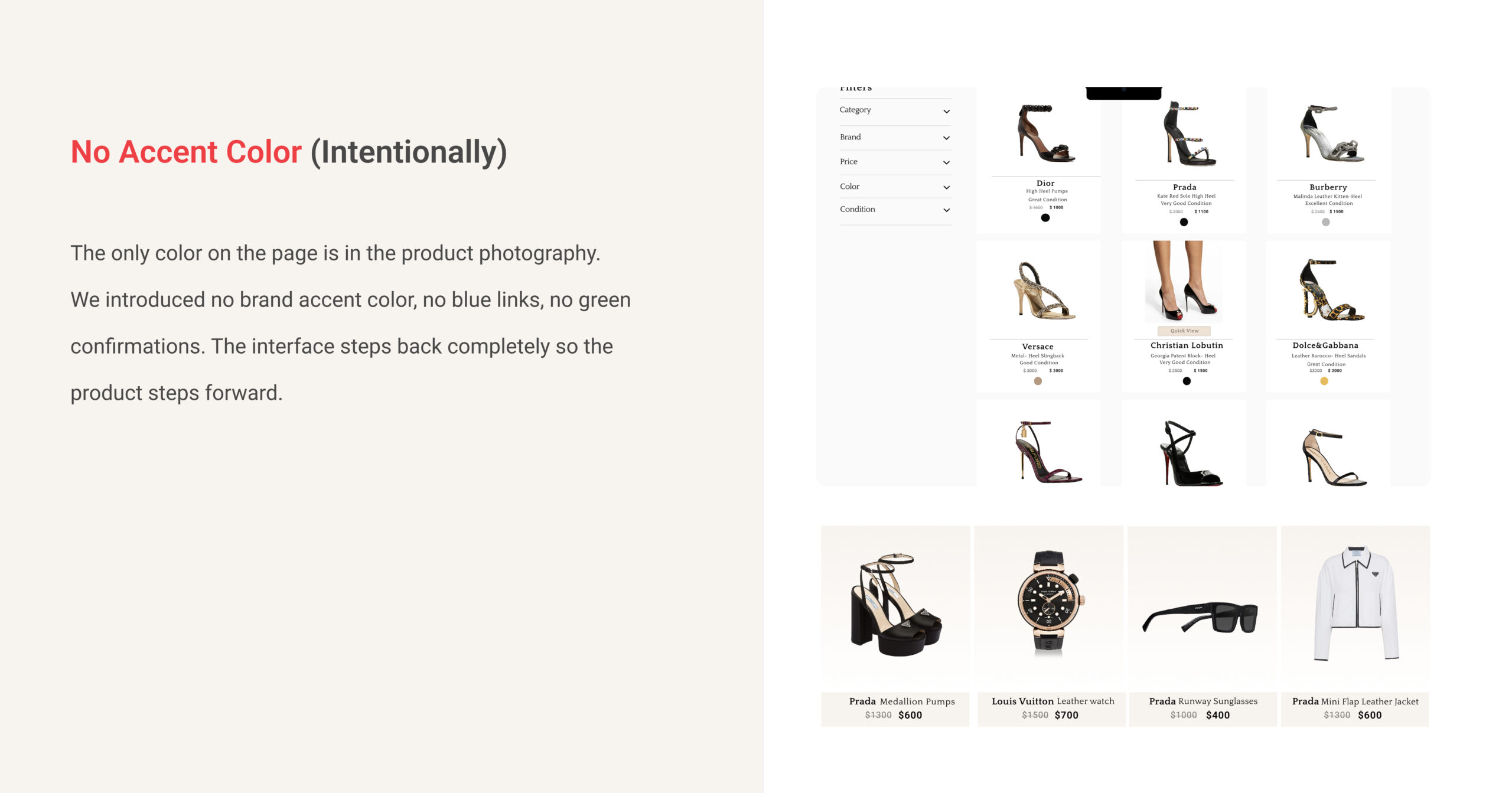
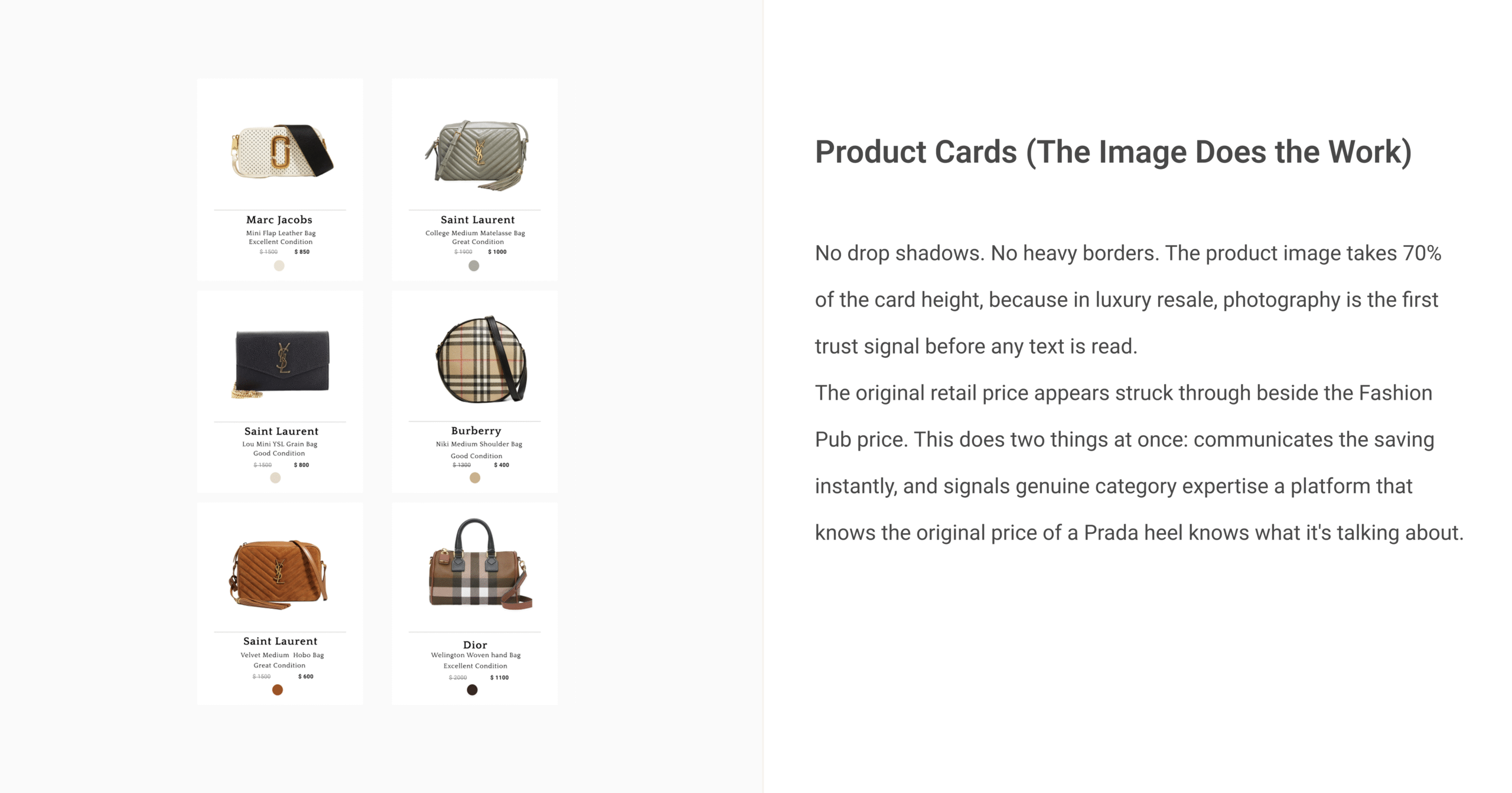
Designing for luxury resale means holding a precise balance: premium enough to earn trust for an $800 purchase, approachable enough for everyday browsing. Every visual decision below was made to hold that balance deliberately.

Typography (Two Personalities, One System)

The bold condensed serif “FASHION” signals editorial authority, it belongs to the same visual world as Vogue and AnOther Magazine. The italic “Pub” beneath it softens that authority and adds personality. Together they say: premium, but not intimidating.

All UI text uses a geometric sans-serif, chosen for legibility at small sizes and to deliberately contrast with the word mark. The UI text serves. The logo leads.

Three weights only, bold, regular, light. Every extra weight is an opportunity for visual noise. We kept it quiet.

Usability Testing

Two rounds of testing. Two significant changes. Both came directly from watching real people.

We ran moderated remote usability testing with 5 participants across five tasks: browse the site, search for a specific item, read a product listing, add to cart, and complete a purchase.

What broke in round one and what we fixed:

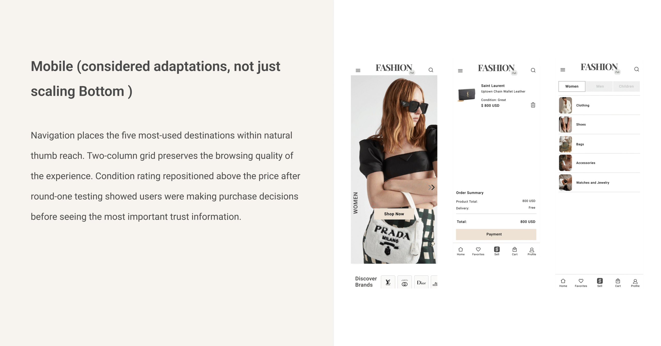
  1. The condition rating on mobile was below the fold. Users were deciding whether to click through before seeing the most important trust information. We moved it directly beneath the hero product image above the price.
  2. Quick View didn’t exist yet. Users were experiencing navigation fatigue clicking through product pages, going back, repeating. We designed and added Quick View before round two. The difference was immediate.

What held across both rounds:

  • The visual condition slider every participant understood it without explanation.
  • The certification badge no user questioned it or missed it.
  • The curated homepage not one person complained about not seeing enough products upfront.

Final Design

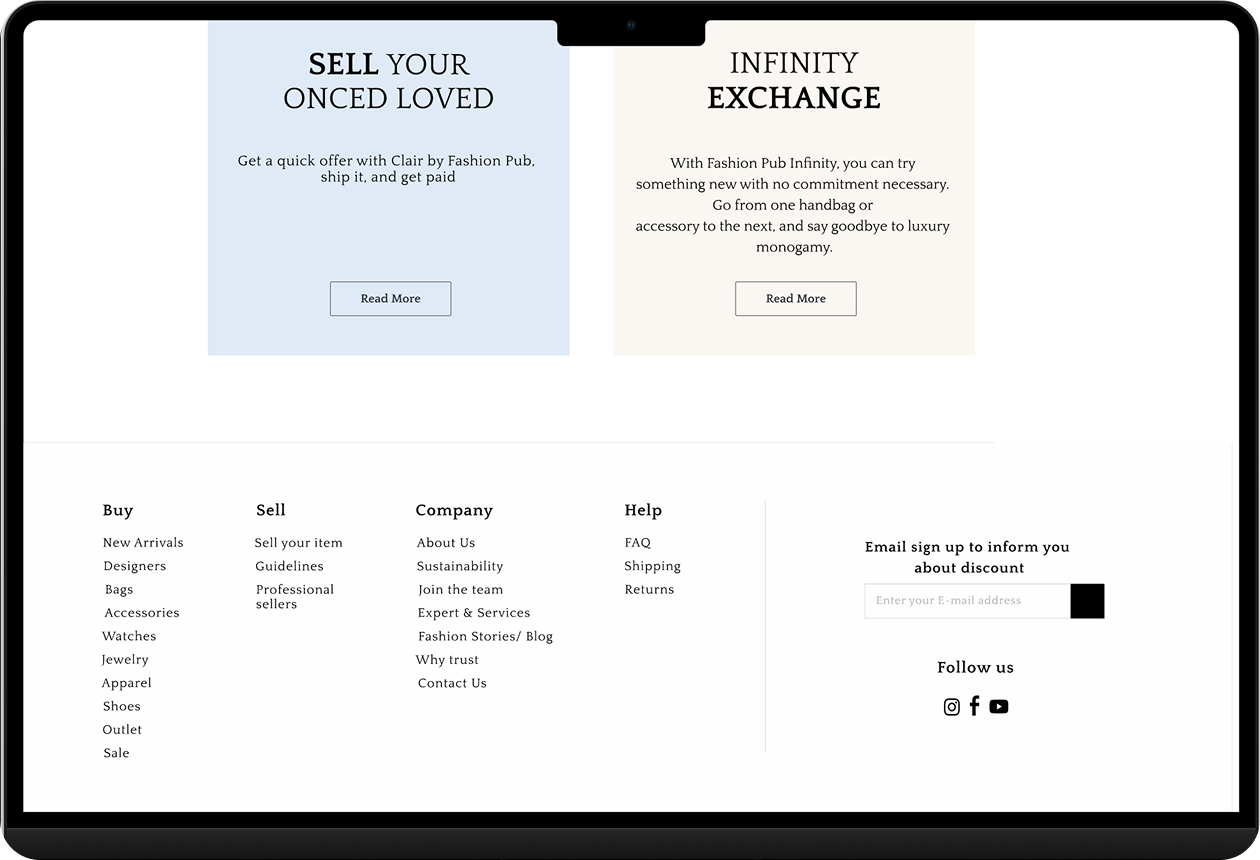
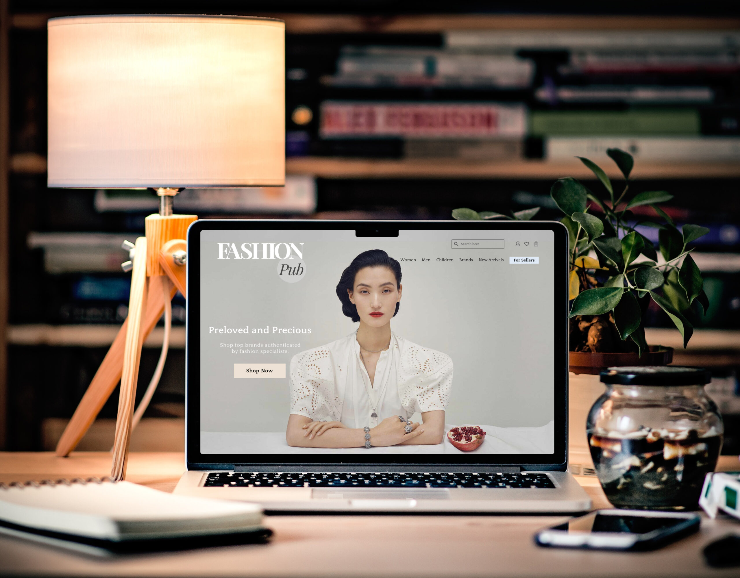
The final product is a luxury resale experience where trust is the visual language not a feature added at the end, but the organising principle of every screen, every interaction, every moment of doubt.

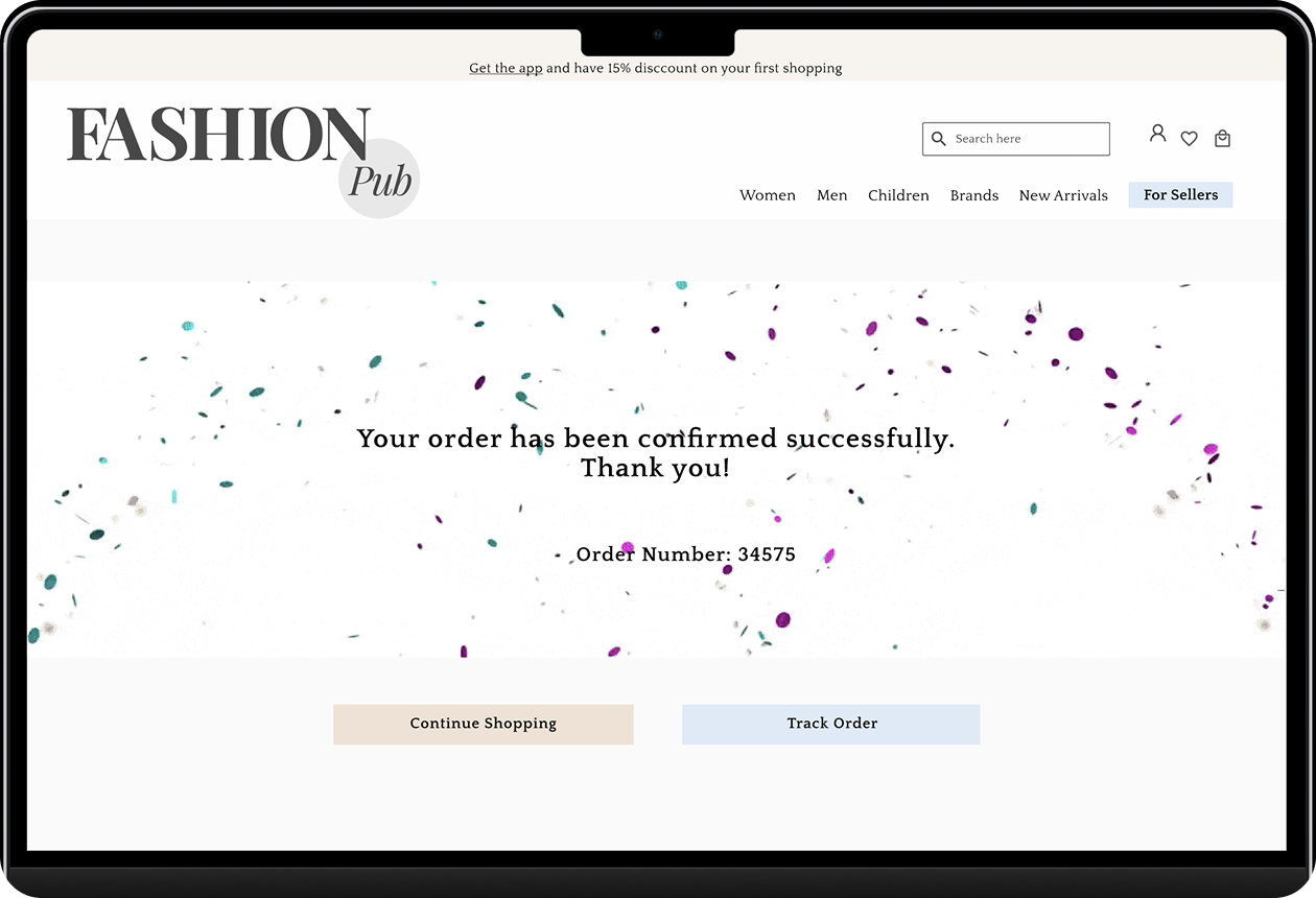
Clean editorial typography that signals premium without exclusivity. Platform-enforced condition ratings that replace seller copy with expert precision. Authentication visible in both Quick View and the product page. A checkout that reassures rather than just processes.
And finally Perfect Match. A styled recommendation panel on every product detail page, curating complementary items that complete the look. Not random suggestions a deliberate design decision that positions Fashion Pub as a destination for people who think about how they dress, not just what they buy. That distinction is what separates a marketplace from a brand.

Desktop Version

Mobile Version

What I'd Do Differently

I’d research the seller experience from the very beginning.

The entire project focused on the buyer’s trust journey. But Fashion Pub is a two-sided marketplace; the people listing their preloved items are just as important as the people buying them. We designed the seller submission and authentication flow almost entirely from assumptions. We never interviewed a seller. We never watched someone try to list a product or navigate the expert pricing process.

In a real product, that’s a structural gap. A seller who finds the listing process unclear or the wait time opaque will simply list somewhere else. And without supply, every trust system we built for buyers has nothing to show.
I’d also instrument trust signals in production. Usability testing told us where doubt surfaced and what resolved it. In a live product I’d want real behavioral data alongside that how many users interact with the certification badge before purchasing, where users pause longest in checkout, what separates a session that converts from one that doesn’t.

Trust isn’t a design problem with a final solution. It’s a promise a product keeps or breaks every single day.