“Designing a dashboard that helps students navigate their study abroad journey at a glance”
The Context
Applying to university abroad is one of the most stressful decisions a young person makes. You’re navigating multiple applications across different countries, programs, and institutions, often for the first time, often without guidance.
Paramount Students exists to change that. A London-based edtech platform operating across the UK and Turkey, Paramount simplifies the study abroad journey, helping students find courses, track applications, find accommodation, and connect with an international community.
When they brought me in, the brief was specific: design a student dashboard that makes the complexity of managing multiple university applications feel manageable and clear.
The Challenge
Students applying abroad are managing a lot, across countries, programs, and timelines simultaneously.
A student using Paramount might be applying to five universities across three countries, tracking different degree programs, waiting on approvals, managing rejections, and updating their personal information, all at the same time.
The dashboard needed to answer three questions the moment a student logged in:
Where am I in the process? What still needs my attention? What does my overall picture look like?
If it couldn’t answer those three questions in under five seconds, it wasn’t doing its job.
Research
Competitive analysis and one targeted user interview.
Given the two-week timeline, research had to be focused and fast. I conducted a competitive analysis of platforms and websites in the edtech space mapping how they handled student dashboards, application tracking, and data presentation. The key finding: most platforms showed information as long lists and tables. Very few surfaced meaningful analytics at a glance.
I also interviewed one student to understand their expectations and pain points around educational platforms. The most important insight they shared: the biggest source of anxiety during the application process was not knowing where they stood. Not knowing if an application had been received, reviewed, or rejected. Not knowing how many were in progress versus completed.
That single insight shaped every design decision that followed: the dashboard had to make status visible immediately without the student having to navigate anywhere or search for it.
The Design Decisions
Data visualization before data tables.
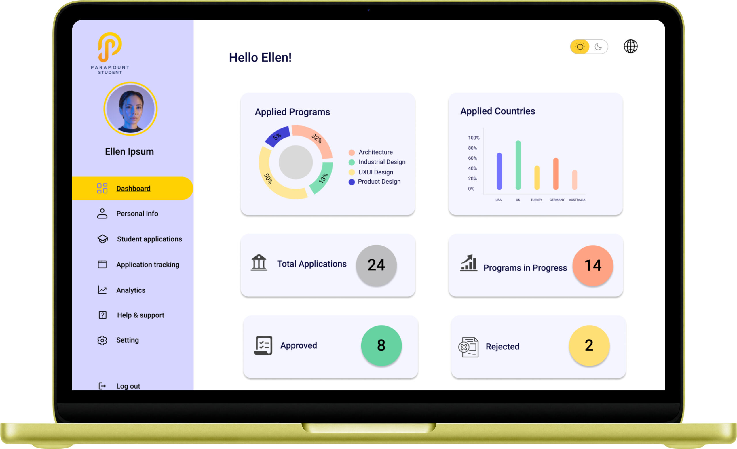
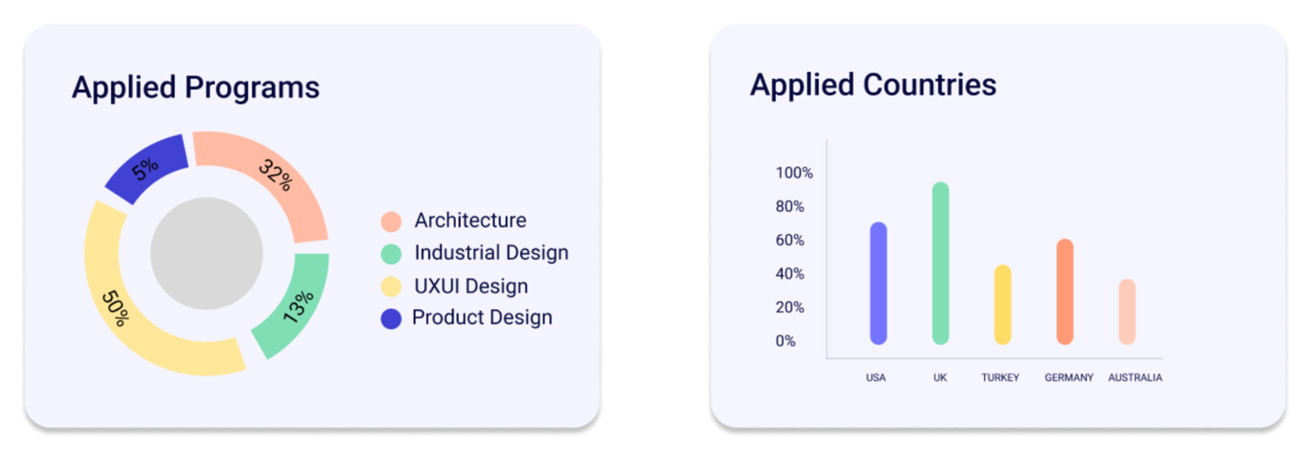
The most important decision I made was leading with analytics rather than a list. The moment a student enters the dashboard they see two charts:
Applied Programs; a donut chart breaking down their applications by field of study: Architecture, Industrial Design, UXUI Design, Product Design. Visual, scannable, immediate.
Applied Countries; a bar chart showing the distribution of applications across countries: USA, UK, Turkey, Germany, Australia. The student understands their geographic spread in one glance.
Below the charts, four stat cards deliver the critical numbers: Total Applications (24), Programs in Progress (14), Approved (8), Rejected (2). Each card uses a distinct color, purple, green, orange, yellow, so status is communicated visually, not just numerically.
The principle: a student should be able to understand their complete application picture in under three seconds, without reading a single row of data.
Clear status at every level.
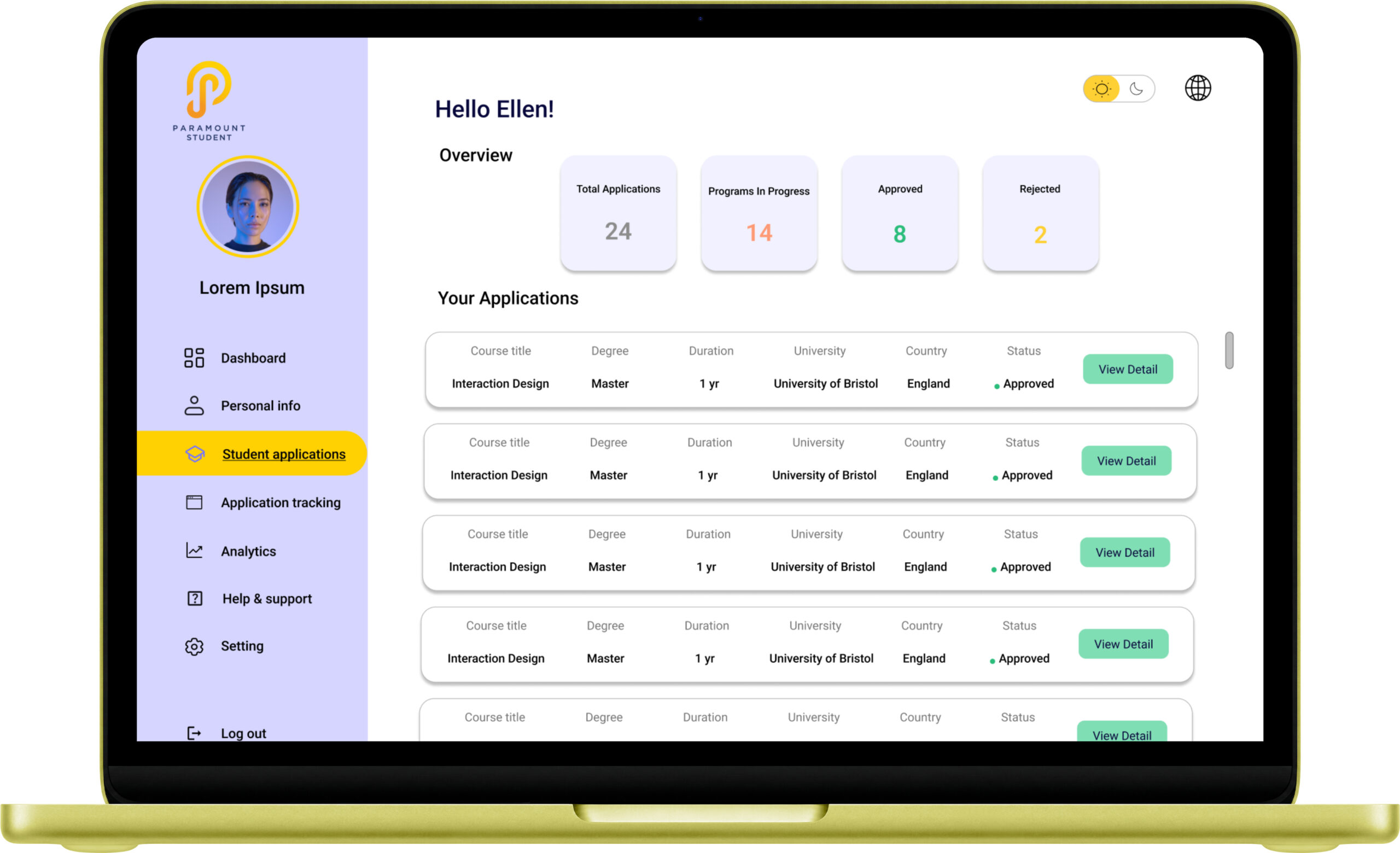
The Student Applications table takes the overview one level deeper. Every application is shown with its course title, degree type, duration, university, country, and most importantly its status. Approved applications are marked clearly in green. The View Detail button gives students a path to the full application without cluttering the table view.
This two-level structure summary at the top, detail available on request reflects a core information architecture principle: show what matters immediately, let users drill into what they need.
Minimal by Design
The edtech space is full of visually busy platforms competing for student attention. For Paramount, I made the deliberate choice to keep the visual language restrained and clean — white and light lavender backgrounds, a single purple/indigo accent colour, consistent card components throughout.
In an environment where students are already managing cognitive load, a calm and structured interface is not a stylistic preference. It’s a functional requirement.
Wireframes to Final
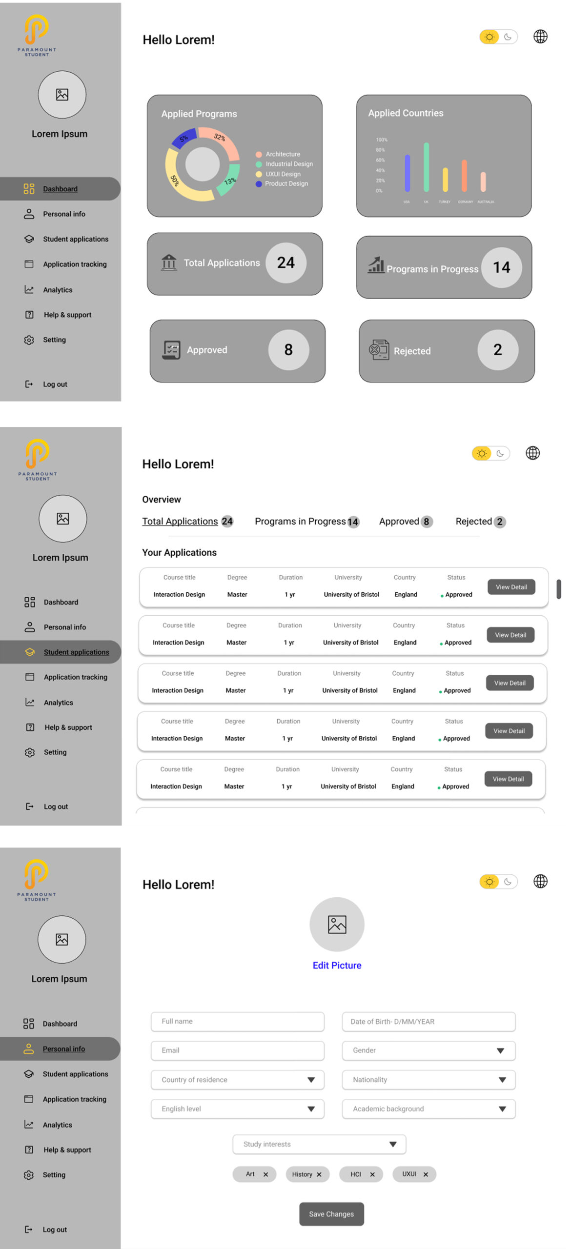
Wireframing was fast and focused. Three screens drove the entire dashboard structure: the main analytics dashboard, the student applications table, and the personal information form. Each wireframe was annotated around the same question: does this screen answer what the student needs to know right now?
The transition from wireframe to high-fidelity was primarily about bringing the data to life. Charts replaced placeholder rectangles. Status indicators replaced text labels. The color system purple for primary navigation, green for approved, orange for in-progress, yellow for rejected was applied consistently across every component.
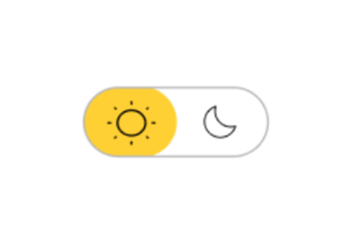
Light and dark mode toggle was included as a practical accessibility feature, students working long hours on applications deserve control over their visual environment.
Visual Design
Every visual decision made for clarity, speed, and reduced cognitive load.
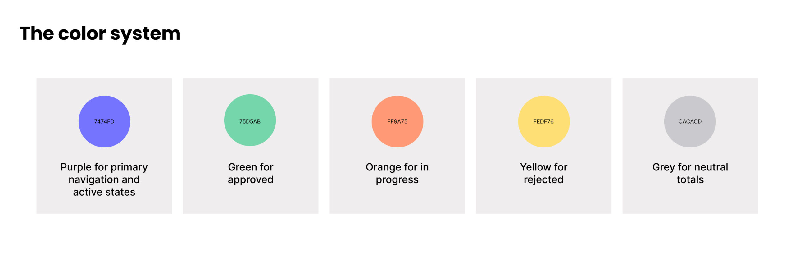
The dashboard uses color as a communication tool, not a styling choice. Each application status has its own color and that color is consistent across every screen, every component, every context.
A student scanning the dashboard never has to read a status label to understand where they stand. The color tells them before the word does. In a product designed to reduce application anxiety, that speed of comprehension matters enormously.
Light lavender surfaces, calm over clinical
The background system uses the same depth logic as professional SaaS products. Pure white for the main content area. Light lavender #E8E8F5 approximately for the left navigation sidebar. Slightly tinted card surfaces to create depth without heavy shadows.
The result is a dashboard that feels structured and professional without feeling cold or intimidating. Students are already stressed about their applications. The interface should feel like a trusted tool, not a bureaucratic system.
The left navigation, always visible, always oriented
The persistent left sidebar Dashboard, Personal Info, Student Applications, Application Tracking, Analytics, Help & Support, Settings, Log Out, ensures the student always knows where they are and where they can go. No hamburger menus. No hidden navigation. Full visibility of the system at all times.
This follows a core principle from Nielsen’s heuristics, visibility of system status, applied to the navigation itself. A student who just received a rejection and needs to update their personal information should be able to find that path immediately, without thinking.
Typography, three weights, maximum clarity
Bold for page titles and key numbers. Regular for labels and navigation. Light for secondary information. Three weights only consistent throughout every screen. The numbers that matter most 24 total applications, 14 in progress, 8 approved, 2 rejected are displayed large and bold so they register immediately on entry.
Data visualization, charts over tables for the overview
The choice to lead with a donut chart and bar chart rather than a table was deliberate. Charts communicate proportion and distribution instantly, a student sees at a glance that 50% of their applications are in one program category, or that the UK has significantly more applications than Germany. A table would require reading and counting. The chart requires only looking.
Tables appear one level deeper in the Student Applications view, where the student is ready to engage with individual records rather than understand the overall picture. This two-level information hierarchy matches the natural way students think about their applications: overview first, detail when needed.
Light and dark mode toggle
The sun and moon toggle in the top right corner gives students control over their visual environment, practically useful for students working across different times of day and light conditions. It’s a small detail that signals the product respects the user’s preferences and working context.
What I'd do Differently
I’d research more deeply before designing.
Two weeks and one user interview is a tight research foundation for a product serving students making significant life decisions. Given more time, I’d interview five to eight students at different stages of the application process, some just starting, some mid-process, some who had already received results. The emotional journey across those stages is likely very different, and the dashboard could be more adaptive to where a student actually is rather than showing the same view to everyone.
I’d also design for the anxiety moments.
The dashboard handles the neutral state well, here is your data, here is your status. But studying abroad involves moments of high anxiety: a rejection arrives, a deadline passes, an application status changes unexpectedly. I’d want to design those moments specifically, how the dashboard communicates bad news, how it guides a student toward next steps, how it maintains confidence during difficult parts of the process.
A dashboard that only works when things are going well is only half a product.