“Designing a Feature That Makes Splitting Bills Feel Natural”


"Sometimes it makes you feel negative about that group of people. You start going out with them less, just to avoid being put in that position again."
This is what one of our research participants told us when we asked about splitting bills with friends. Not about the money. About the relationship. The pattern she described is universal. One person pays the whole bill because it's faster in the moment. Everyone agrees to sort it out later. Some do. Some forget. Some quietly hope it'll be overlooked. And the person who paid is left choosing between an uncomfortable conversation and absorbing a cost that wasn't theirs. Most people choose silence. And over time, that silence changes things. When Digipay brought us in to design their Split Bills feature from scratch, that conversation stayed with us. We didn't treat this as a payment problem. We treated it as a social problem that happened to involve payment.
What is the problem?
Digipay is one of Iran's most widely used fintech applications, a platform where millions of users manage transfers, payments, and everyday financial transactions daily. Despite its scale, when we joined the project in late 2024, Digipay had a significant gap in its feature set: no way to split shared expenses within a group.
This wasn't a minor omission. Splitting costs is one of the most frequent financial interactions in daily social life; dinners, trips, shared gifts, rent between housemates. Every day, Digipay users were handling those situations manually: WhatsApp screenshots, mental arithmetic, bank transfers with handwritten notes, and the inevitable social friction when follow-up was needed.
Our brief: Design the Split Bills feature end-to-end from research to final UI.
Three distinct user groups, all experiencing the same core frustration in different contexts. Friends splitting dinner bills and travel costs. Roommates managing rent, utilities, and household expenses. Colleagues dividing costs during work events. The problem was universal, the solution didn't exist yet inside the platform they already used every day.
Design Goals
Before research, we aligned on what success looked like from two perspectives.
For Digipay as a business: encourage more frequent peer-to-peer interactions within the platform, improve user satisfaction through transparent group payment experiences, and support long-term adoption by integrating shared payments into everyday social use cases.
For users: make dividing shared expenses effortless, show clearly who has paid and who hasn't, allow payment requests and reminders with minimal social friction, and make settling balances quick and easy.
Research Phase
98 survey responses. 5 in-depth interviews. The data confirmed what we already felt and surprised us with what we hadn't anticipated.
I interviewed active Digipay users to understand how shared payments actually happen in everyday situations. Between my colleague and I, we conducted 5 in-depth interviews. I personally led 3 of them. We focused on one question above everything: "what actually happens when a group needs to split a shared expense, and where does it break down?"
We didn't ask about apps. We asked about experiences.
The survey gave us quantitative grounding. The interviews gave us the human texture behind the numbers. By synthesizing observations through affinity mapping, clear patterns emerged the main challenges were social rather than technical.

The pain point breakdown from 98 responses:
- 😶🌫️Lack of Accountability 27.51% (27 people): No clear visibility into who has paid and who hasn't the biggest single frustration.
- 😵💫Manual Process 23.46% (23 people): Sending individual payment requests, calculating amounts, tracking manually all of it tedious and time-consuming.
- 🫣Discomfort to Request 19.38% (19 people): Asking for money between friends feels awkward. Most people avoid it entirely.
- 😕Forgetting Payments 15.32% (15 people): Genuine forgetfulness people intend to pay but have no system reminding them.
What the interviews revealed beyond the numbers:
Three patterns came out of every conversation independently.
The payer's position is the most vulnerable. Once you've covered a bill for others, you're stuck ask and feel petty, stay silent and lose money. Most people chose silence. The discomfort of asking outweighed the financial cost.
Manual tracking is genuinely exhausting. Scrolling through bank notifications to check who paid. Keeping mental notes across multiple group occasions. The cognitive load fell entirely on the person who had already done the most paying upfront.
Nobody in our user base had used a dedicated split bill feature before. This finding changed our design strategy most significantly. We were introducing an entirely new behavior to millions of users who had no mental model for it. Onboarding wasn't optional. It was critical.
Benchmark Analysis
We studied five platforms to understand what already existed and where the real gap was.
We benchmarked Swish, Revolut, Klarna, PayPal, and Splitwise, comparing split payment features, ease of use, unique capabilities, and target audiences.
The key finding: every platform had solved parts of the problem. Splitwise tracks group expenses well but lives outside the payment infrastructure. Revolut handles splitting within their ecosystem but only for Revolut users. Swish enables instant peer-to-peer payments beautifully but has no group expense tracking.
The gap we identified: A feature that lives inside the payment platform users already trust combining group expense tracking, real-time payment status visibility, automated reminders, and the ability to include people who don't have the app. That specific combination didn't exist in the market we were designing for.
User Journey Mapping
We mapped two journeys the payer and the person who owes. The pain points were different. The discomfort was the same.
The payer's journey surfaced four pain points: forgetting to collect payments after covering the bill, no accountability system tracking who has settled, the manual effort of chasing individual payments, and ultimately absorbing extra costs alone when asking becomes too uncomfortable.
The transfer side revealed its own set of problems: forgetting to transfer at all, no clarity on the exact amount owed, discomfort when receiving payment reminders that feel like personal accusation, and lack of transparency about whether the receipt matches what they actually ordered.
Mapping both sides together showed something important: the discomfort is symmetrical. The payer doesn't want to ask. The person who owes doesn't want to feel chased. Both sides want the same thing a system that handles the financial coordination so the relationship doesn't have to.
Ideation & Prioritisation
We generated ideas, then filtered ruthlessly against what would actually work for real users.
We placed every feature idea on an Impact-Effort Matrix. The high-impact, low-effort quadrant, our immediate priorities, contained four ideas that became the core of the feature: transparent payment tracker, automatic reminders and instant notifications, digital receipts and link sharing, and customizable splits.
Higher-effort features AI-powered receipt parsing, group fund management, tip and service fee calculation, were documented for future phases. Build trust with the core experience first. Layer sophistication after adoption.
Feature Prioritisation Criteria
We assessed each prioritised feature against five criteria: user value, technical feasibility, business impact, likelihood of user adoption, and cultural sensitivity. The cultural sensitivity criterion was specific to Digipay's Iranian market context, a feature that works perfectly in one cultural setting can create discomfort in another.
Automated reminders and notifications scored High across all five criteria, confirming it as the right feature to lead with and the most direct design response to the social discomfort our research identified.
Automated Reminders and Notification
Digital Receipts & Link Sharing
Transparent Payment Tracker
Customizable Splits
The Hardest Decision
The product design lead didn't agree with my animation. I proved him wrong with usability testing.
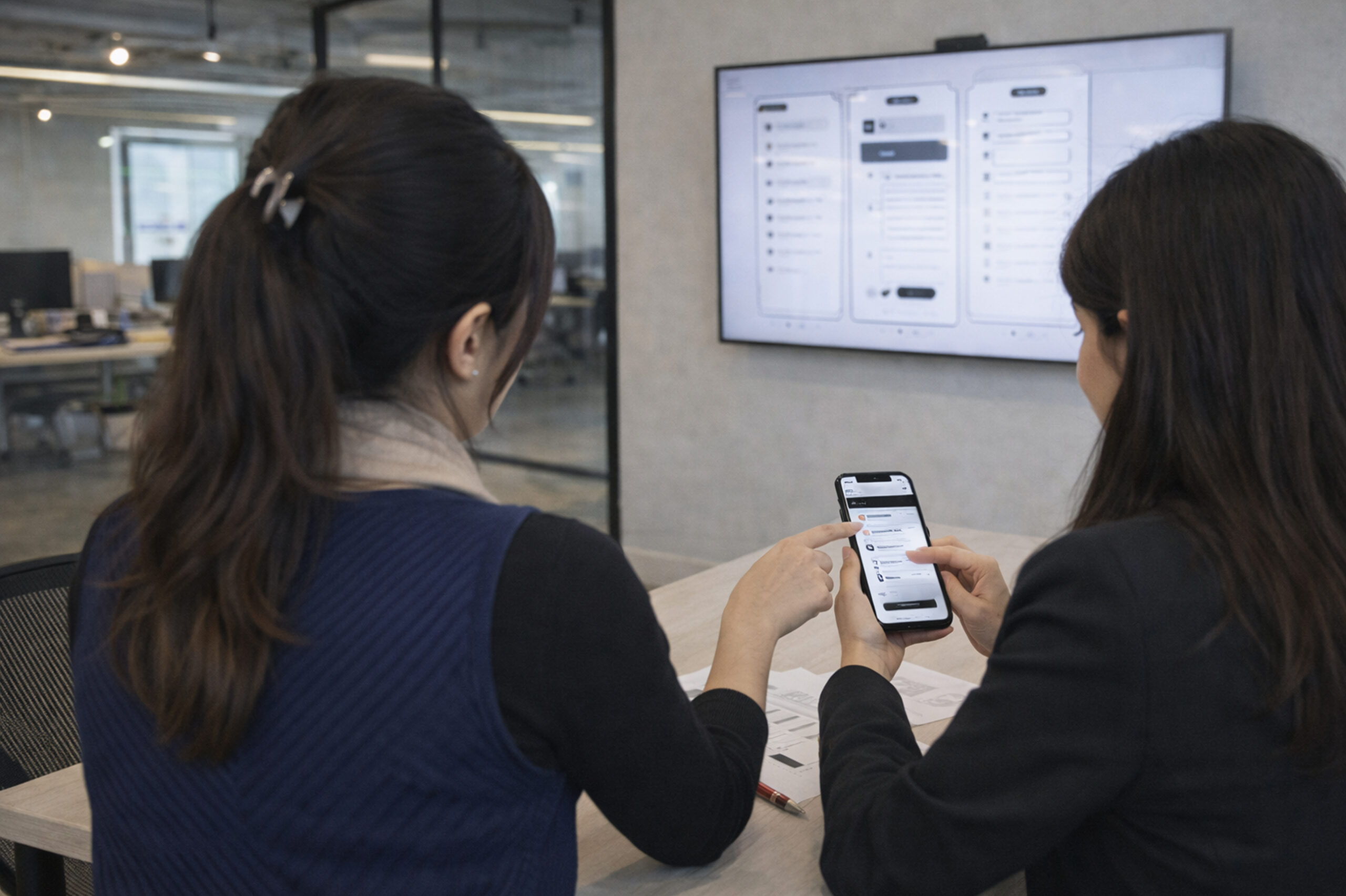
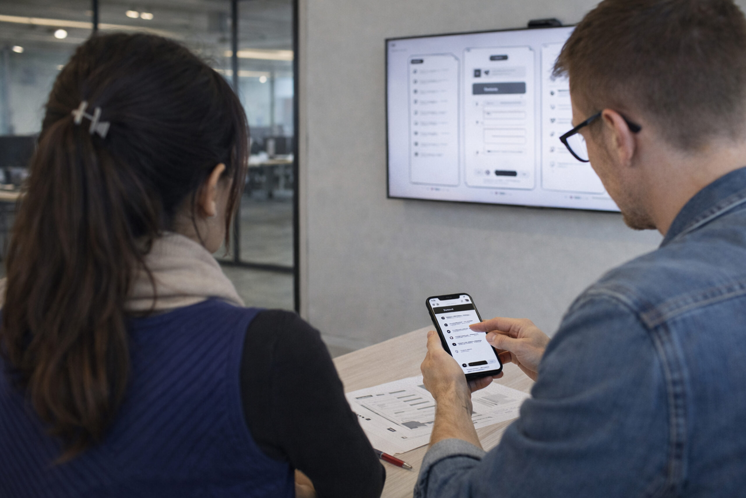
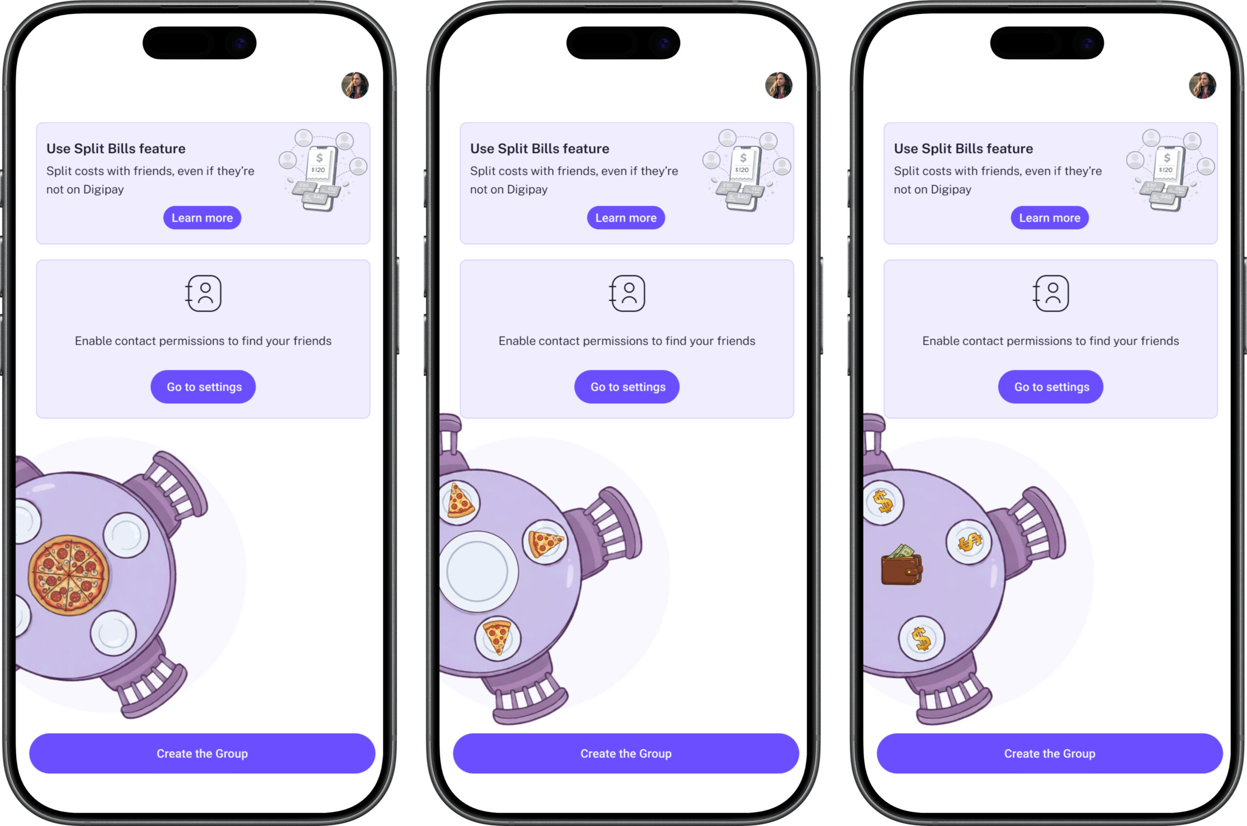
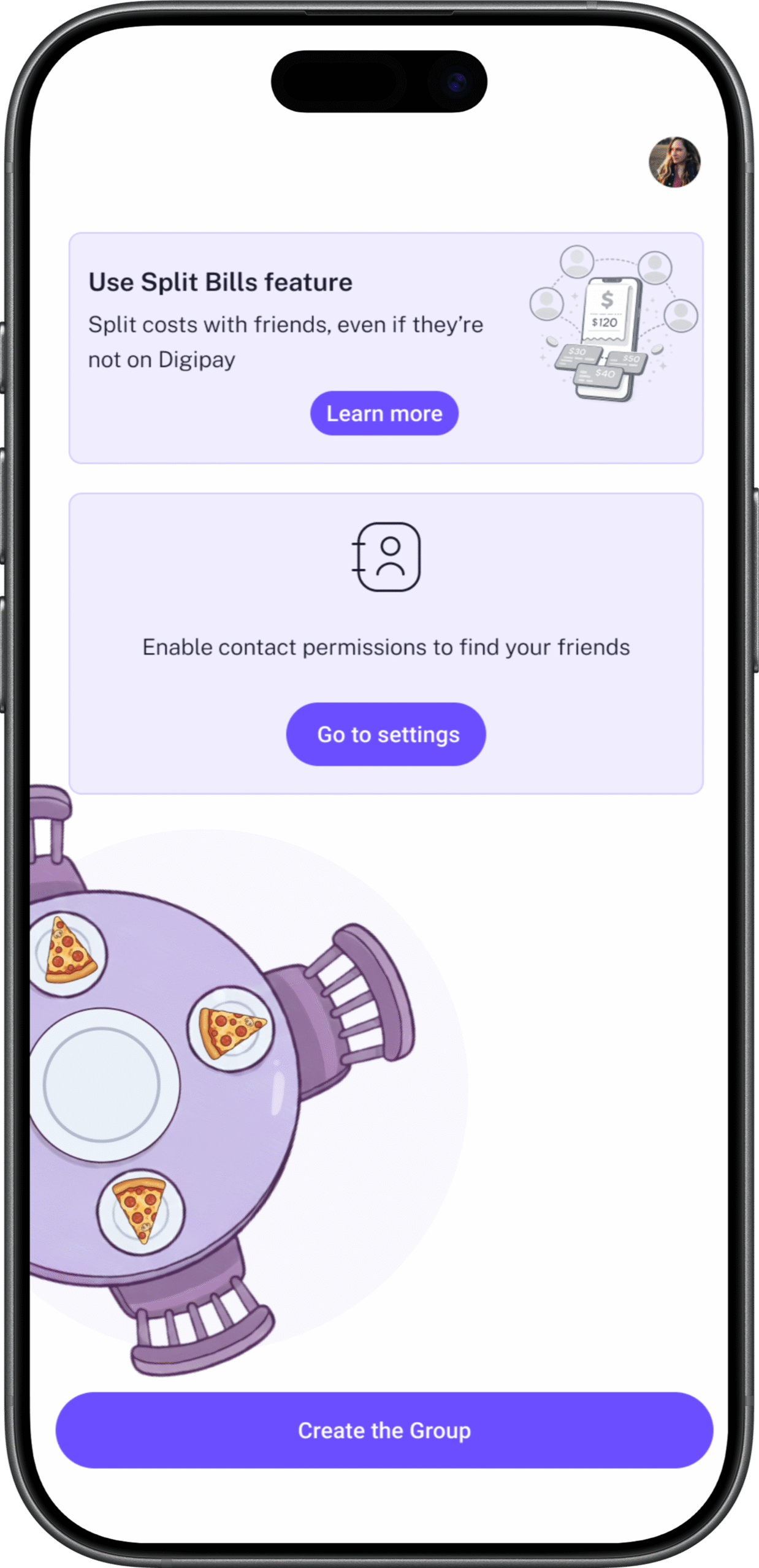
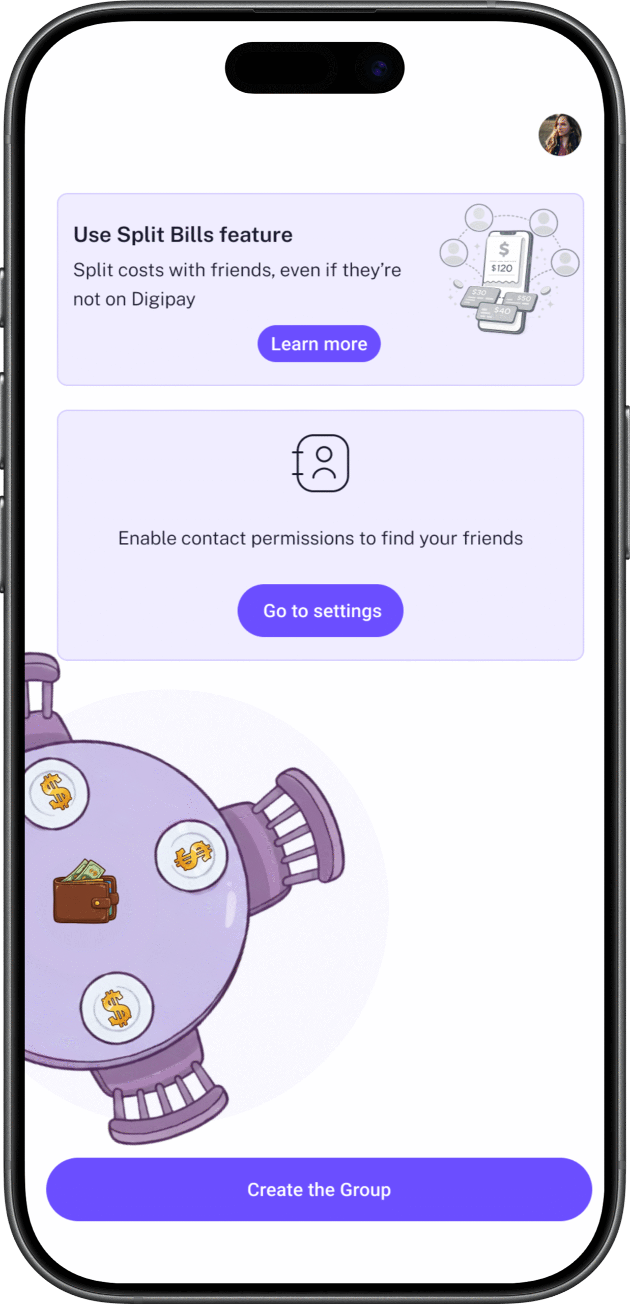
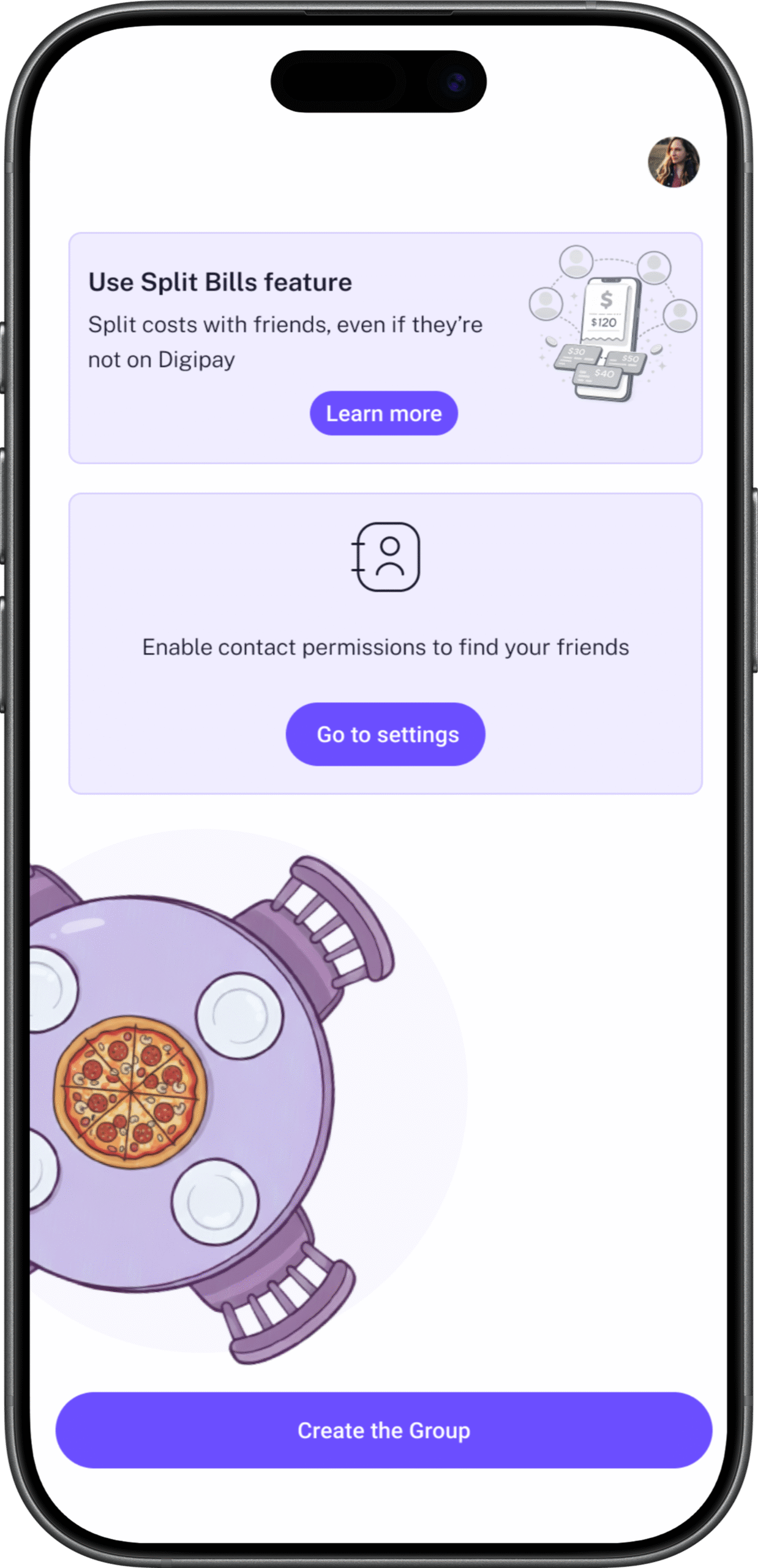
The onboarding animation I designed, a rotating table with pizza slices appearing on individual plates, each person taking their portion, the bill settling in the centre, was rejected in the first review. The product design lead felt it was unnecessary, potentially confusing, and that a new feature should communicate through straightforward text and static illustration rather than animation.
I understood his position. But I had a specific reason to push back.
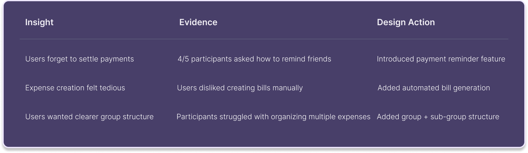
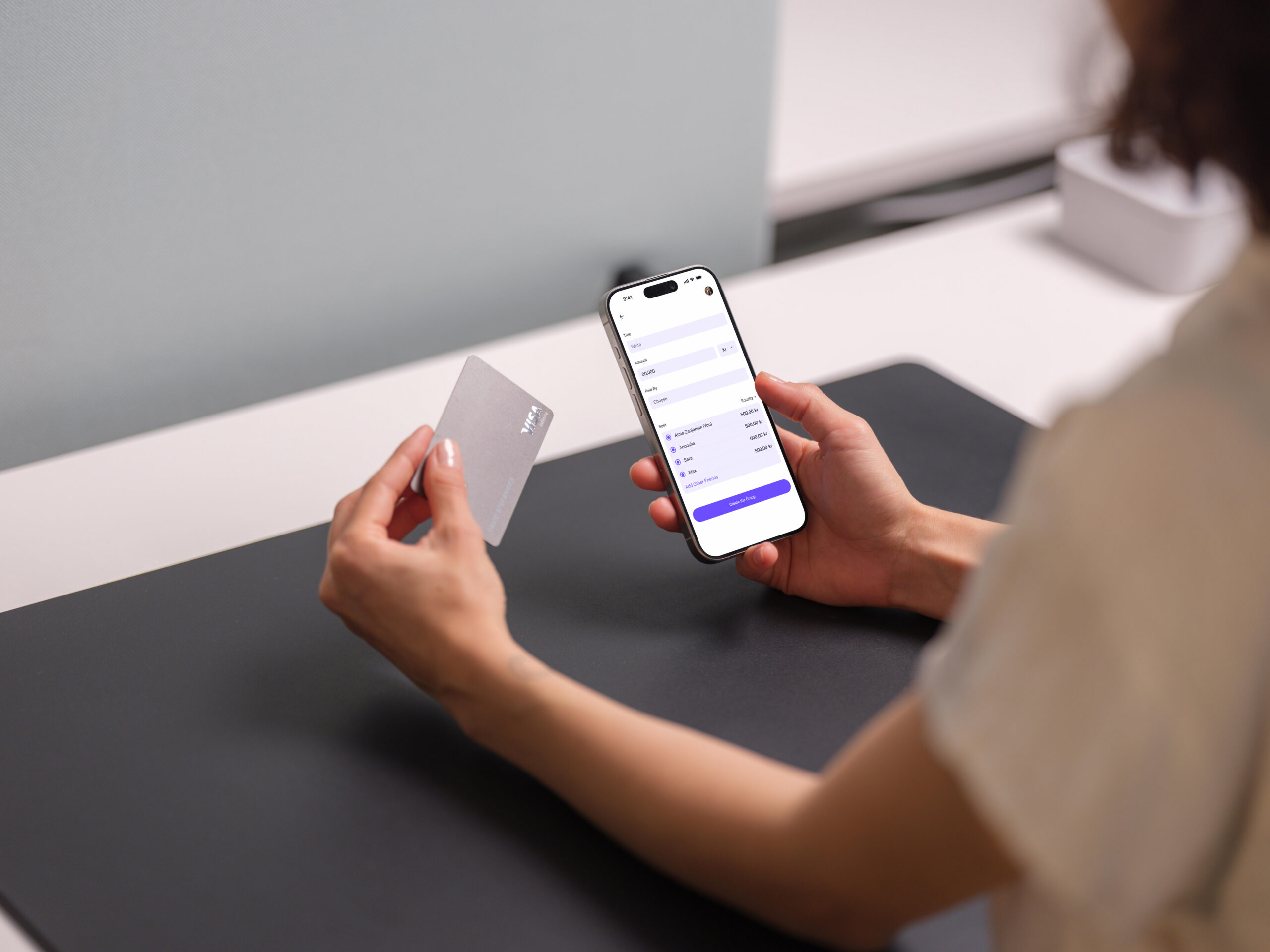
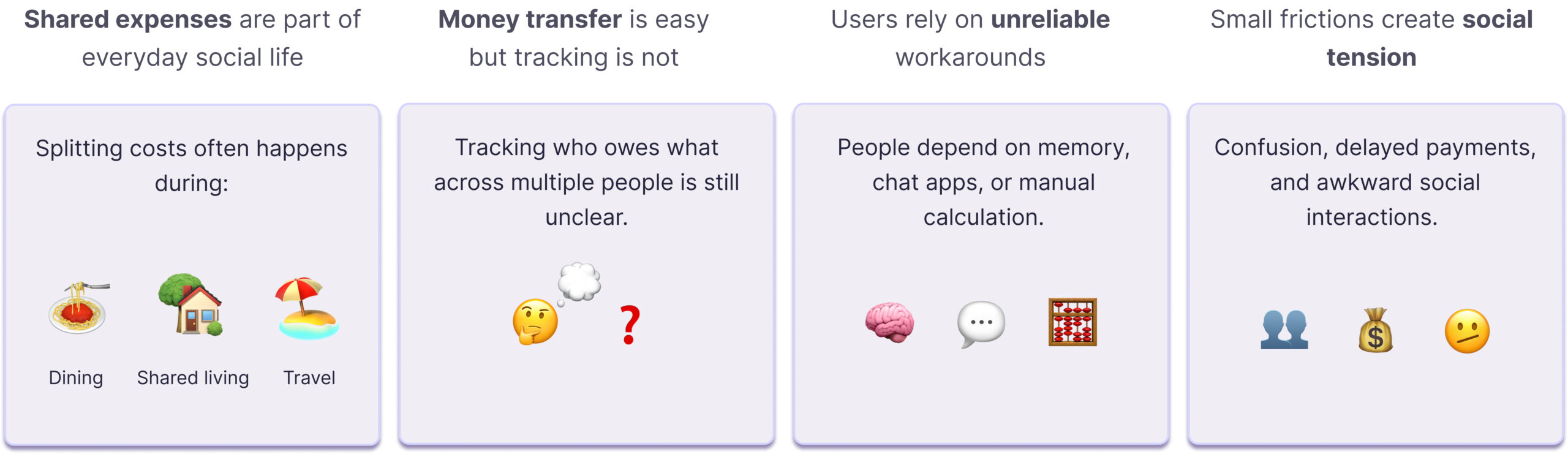
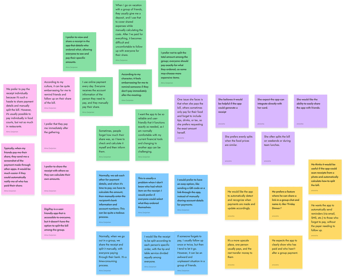
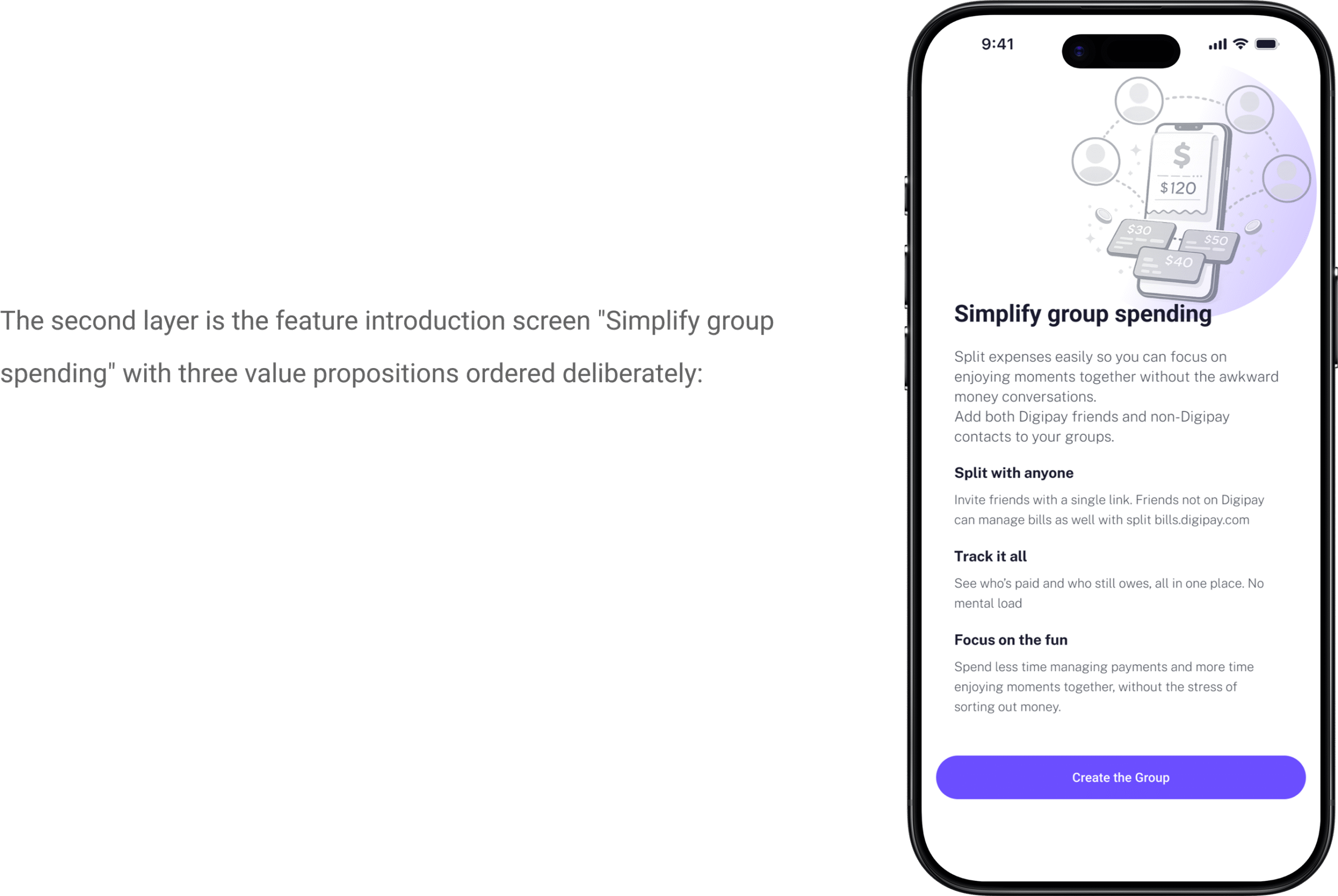
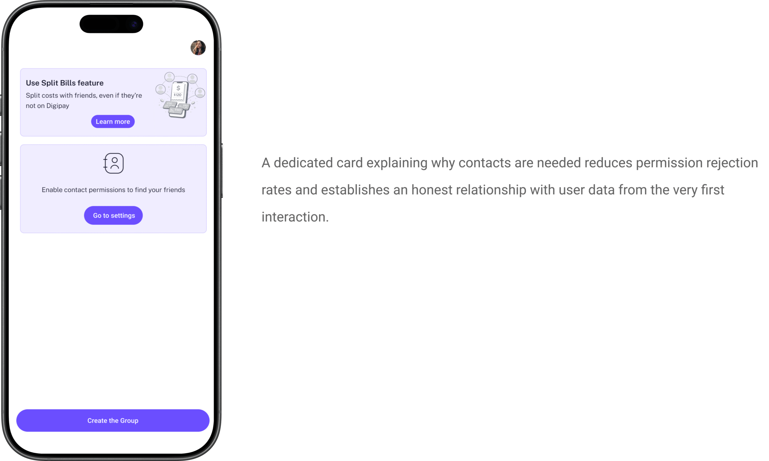
Because no user in our research base had ever used a split bills feature inside a fintech app, the first seconds of onboarding were carrying critical weight. Users needed to understand the concept immediately and intuitively, not just read and comprehend, but feel what the feature was for before a single word of explanation.
The animation tells a complete story without words: people gather, food is shared, each person has their portion, the bill is divided and settled. A full social and financial narrative in a few seconds of motion.
I structured usability testing questions specifically around comprehension, did participants understand what the feature was for before reading any text? The results were unambiguous. Participants who experienced the animation understood the concept immediately. Several smiled instinctively when it played the exact emotional register I was designing for. Something that felt light and social, not transactional.
The product design lead reviewed the testing evidence. The animation stayed.
Wireframes
Fast, lo-fi, and focused on structure, not aesthetics.
Wireframing was deliberately rough and rapid. The goal at this stage was mapping the information architecture and user flow, which screens connected to which, what information appeared when, where in the sequence key decisions were made.
Every wireframe was annotated with one question: what does the user need to know or do at this exact moment?
The hand-drawn approach kept the team focused on function. There was no temptation to refine visual details that hadn't been validated yet. Structure first. Everything else after.
The Onboarding Flow
Making a brand new feature feel instantly familiar.
The onboarding has two layers working simultaneously.
The first is the animation, the rotating table, the pizza slices, the visual metaphor of everyone taking their share. Before any text is read, the user understands: this is about sharing, this is about splitting, this is social. I wanted the first emotional response to be a smile, not a question mark.
Split with anyone comes first because our research showed this was the most common anticipated barrier. Users would immediately ask: what if my friends don't have Digipay? We answered that question before they finished reading the screen.
Track it all addresses the mental load directly, no more scrolling through bank notifications, no more mental arithmetic, no more WhatsApp threads.
Focus on the fun is the emotional promise. The app carries the awkward part so you don't have to.
The second onboarding card addresses contact permissions, a practical necessity presented with care:
Group creation
Designed so a user can create a group and add their first expense in under two minutes.
The category chips born from user confusion
Our first design had no chips. Just an empty text field with a cursor. In testing, this created consistent friction, users paused at the blank field unsure how to name their group. Decision paralysis at the very first step.
The chips; Vacation, Home, Party, Family, solved this in two ways simultaneously. They provided instant naming suggestions users could tap to populate the field. And they showed users the range of situations this feature supports. The moment someone saw “Vacation,” they understood immediately: this works for our summer trip too. The chips weren’t just UI convenience, they were a discovery mechanism for use cases.
The AI emoji assignment, a design judgment call
My colleague proposed allowing users to upload or choose a profile photo for each group. Reasonable. Personal.
I disagreed. And the product design lead agreed with my reasoning.
Adding photo upload to group creation adds friction at exactly the moment when a user wants to do something practical quickly. It places a creative burden on the user, choose or upload a photo, when their goal is to split a bill, not curate a group identity.
Instead we designed AI-generated emoji assignment. The system reads the keywords in the group name and assigns a contextually appropriate emoji automatically. No decision required from the user.
The result: a group list that feels personal and immediately scannable, without any creative effort from the user. AI reducing cognitive load.
Expense tracking; Adding an expense required four pieces of information: what was it, how much, who paid, and how to split it. That’s the complete mental model of a shared expense.
The split defaults to Equally the most common scenario with individual amounts calculated automatically and displayed immediately. The user never touches a calculator. The mental arithmetic participants described as exhausting is removed entirely.
The three-tab structure across the group view, Expenses, Balances, Bills divides the information cleanly by purpose. Expenses is your history. Balances is your current status. Bills is your documentation.
The Send a Reminder button is the feature I’m most proud of because of what it replaces.
It replaces the personal, uncomfortable, relationship-straining conversation our research participants described giving up on entirely. It doesn’t come from you, it comes from the app. The payer doesn’t have to compose a message, choose words carefully. And the person receiving it gets a neutral payment notification, not a message from a friend that could be misread as frustration or accusation.
One button removes the primary social pain point our research identified from day one.
The most important screen in the feature, the one that replaces the awkward conversation.
This is where the social problem gets its design solution.
The Balances tab shows every participant’s status in one immediate view. Green and positive for paid. Red and negative for unpaid. No ambiguity and mental tracking. No WhatsApp archaeology.
For non-Digipay users a critical challenge, a contextual flag appears: “This contact is a non-Digipay user. Share the link.” Rather than blocking the experience or requiring app downloads, the feature offers an immediate resolution path.
The QR code and shareable link serve two formats of the same solution. In person, scan the QR code at the table. Remote, send the link via any messaging app. The same feature works for both contexts without requiring the user to think about which format applies.
Iterations from Testing
What usability testing changed and what it added.
We ran in-person moderated usability testing with 5 participants aged 24–45. Four tasks: create a group for a trip, add an expense, split a bill, check balances.
Payment Reminders: 4 out of 5 participants asked how to remind friends. The reminder mechanism wasn’t prominent enough in the first version. We made Send a Reminder the primary CTA on the Balances screen, not a buried option, but the most visible action when an unpaid balance exists.
Group Structure and Organization: Participants struggled organizing multiple expenses across different occasions within one group. They expected sub-categories. We added the hierarchical group structure, allowing a “Trip” group to contain separate expense categories for accommodation, food, and activities.
Bill Upload Capability: Two out of five participants instinctively looked for a way to photograph and attach the original receipt. This wasn’t in our original design. Testing revealed it. We built it before final delivery. Attaching the original bill removes any possible ambiguity about the amount, the ultimate trust mechanism in a shared expense.
Net Balance Calculation: Users expected the system to automatically calculate the net balance between participants. If User A owes User B 1000 SEK and User B owes User A 500 SEK, the app should show a simplified result: User B owes User A 500 SEK. We added automatic net balance calculation to remove this mental arithmetic entirely.
Flexible Participant Management: Users needed a flexible way to include both Digipay and non-Digipay participants. We solved this by enabling invitations via QR code and shareable link, no app download required for the recipient.
Visual Design
The colour system, four levels of depth
White #FFFFFF for the app background. #F8F7FF near-white with a faint purple tint for card surfaces and participant rows. #F0EDFF light lavender for input fields and interactive containers. #6B4EFF primary purple for CTA buttons, selected states, and active indicators.
This creates visual hierarchy through colour temperature rather than shadow a more refined and accessible approach.
Final Design
Following key improvements and iterations, the final design simplifies group expense management, reduces manual effort, and improves clarity across every step of the experience.
From the moment a group is created, the feature works so the user doesn’t have to. Expenses are tracked automatically. Balances are calculated in real time. Reminders are sent without the user having to initiate an uncomfortable conversation. Non-Digipay users are included seamlessly through QR codes and shareable links.
By addressing the real problem, social discomfort around money, not just technical complexity, the design transforms a fragmented and awkward experience into something that feels natural, fair, and easy.
What I'd Do Differently
I’d design for the receiving end of a reminder.
We spent significant design energy on the person sending a reminder, removing their discomfort, making the action feel neutral and easy. We didn’t spend enough time designing what happens on the other side.
What does the notification look like when someone receives a payment reminder? What does it say and in what tone? Does it give the recipient a frictionless one-tap path to pay immediately? Or does it send them on a journey through the app before they can settle?
In the next version, I’d design the complete reminder loop, notification copy, landing screen for the recipient, one-tap payment confirmation, so the experience closes as seamlessly as it opens.
I’d also test with a wider age range.
Our 5 usability test participants were aged 24–45. The feature is equally relevant for older adults, parents splitting holiday costs, colleagues at company dinners. Older users may have different comfort levels with AI-generated content, different expectations around privacy, and different patterns of trust in automated reminders. Testing only with younger users gave us confidence for one segment while leaving others untested.
The biggest thing I learned:
The hardest part of designing a financial feature isn’t the numbers. It’s the relationships. Every screen in this project was ultimately about protecting the social bond between people while helping them be fair to each other about money. The moment I understood that, really understood it, every design decision became clearer.